A Visual Identity celebrating diversity, empowerment, and support
TBD Health is the startup that’s shaking up the home STI testing market. They are creating an experience that will change how women think about their sexual health for good.
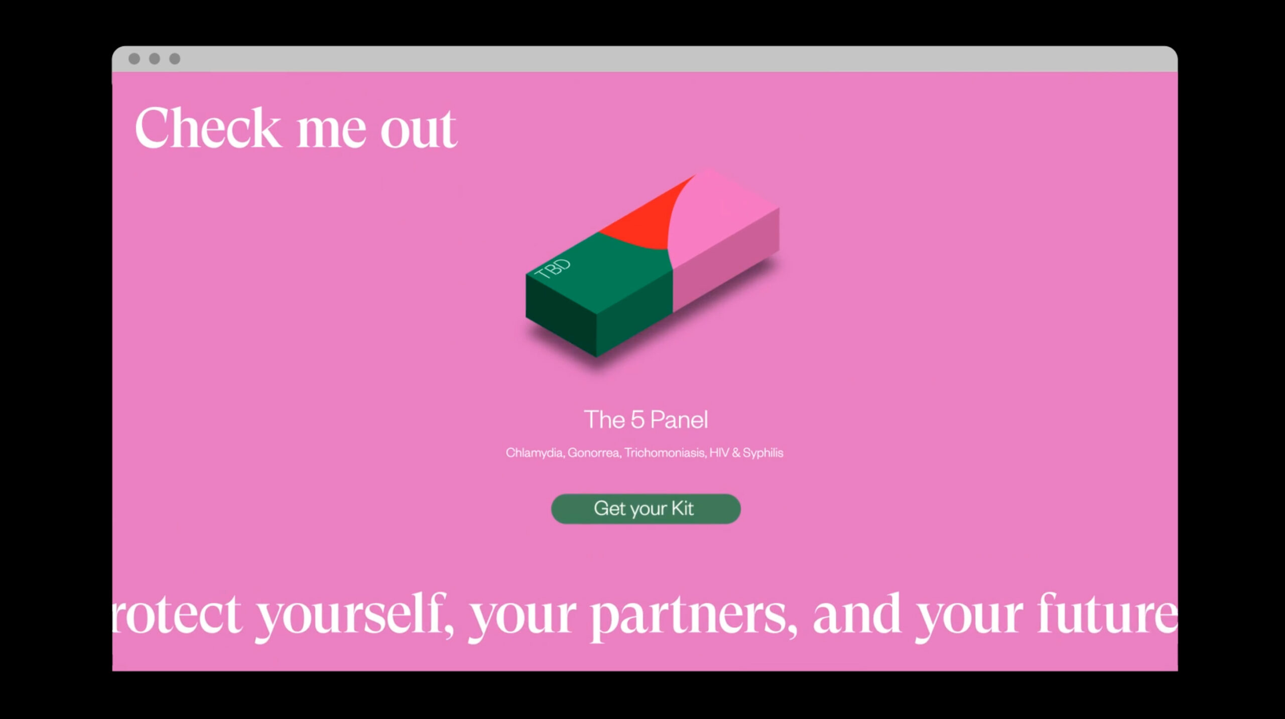
Knowing is better than not knowing. That’s why TBD makes sexual health testing quick, easy and totally private so women can know more with less hassle, and feel empowered to take care of their health. The TBD community also offers continuous support before, during and after testing.
Daphne Chen and Stephanie Estey, the Co-founders and Co-CEOs, commissioned us for a full branding package with a clear brief: they wanted a visual identity that was engaging, inclusive and empowering.
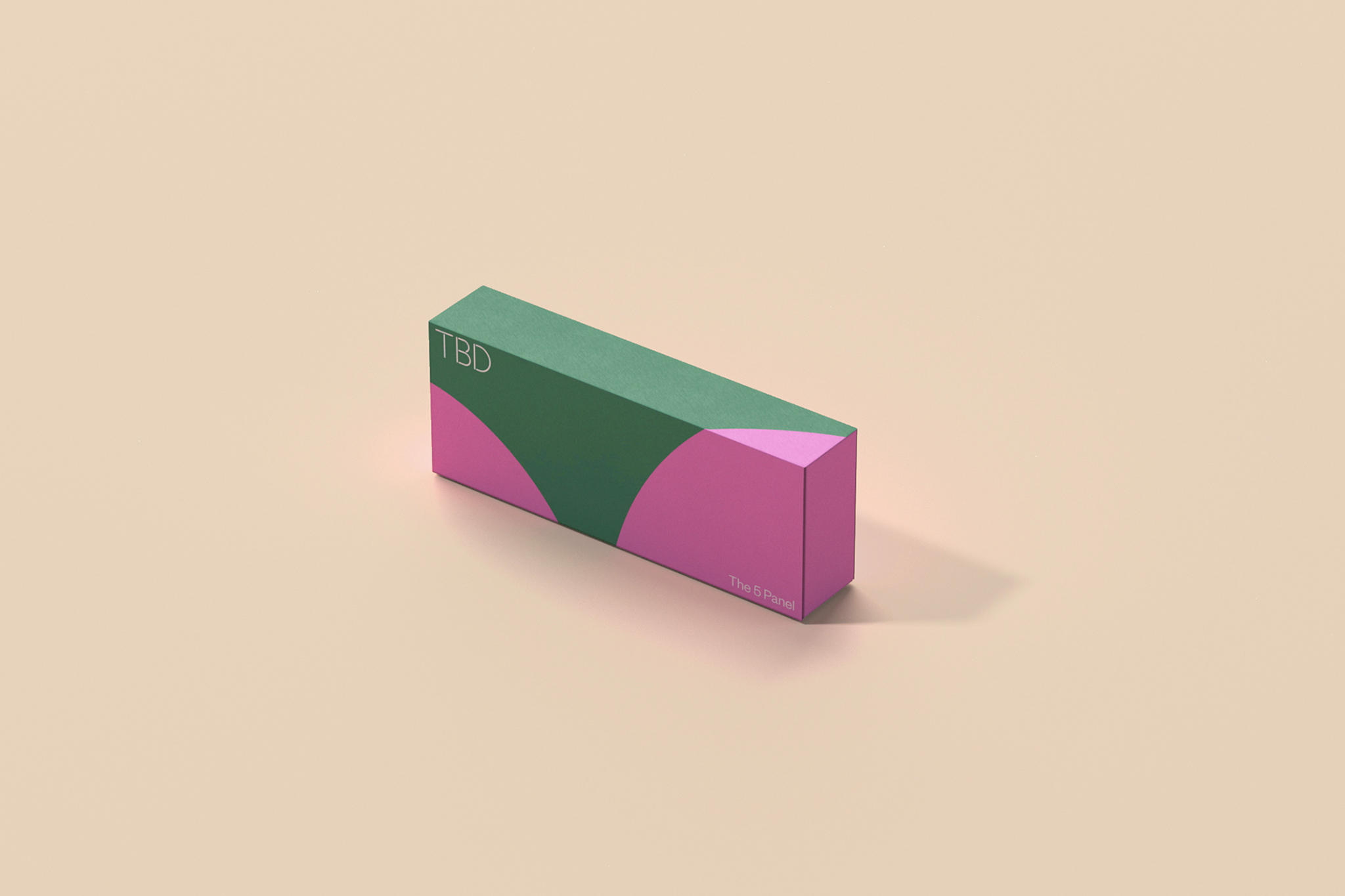
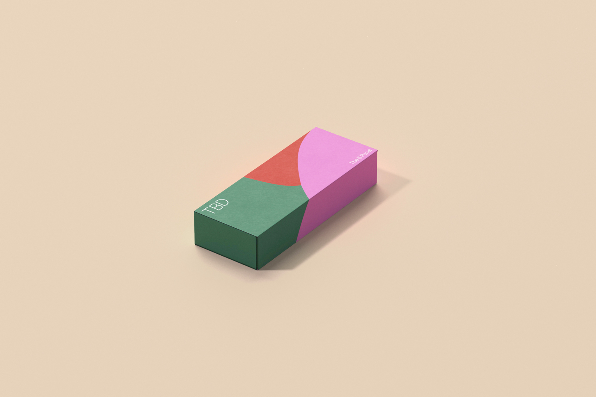
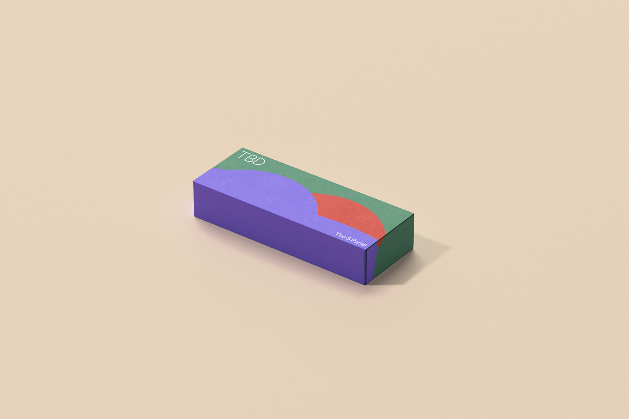
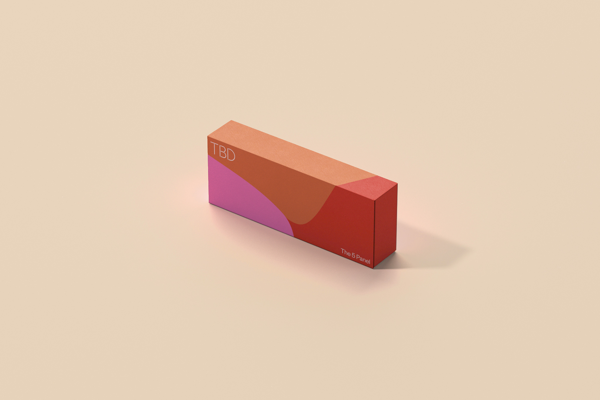
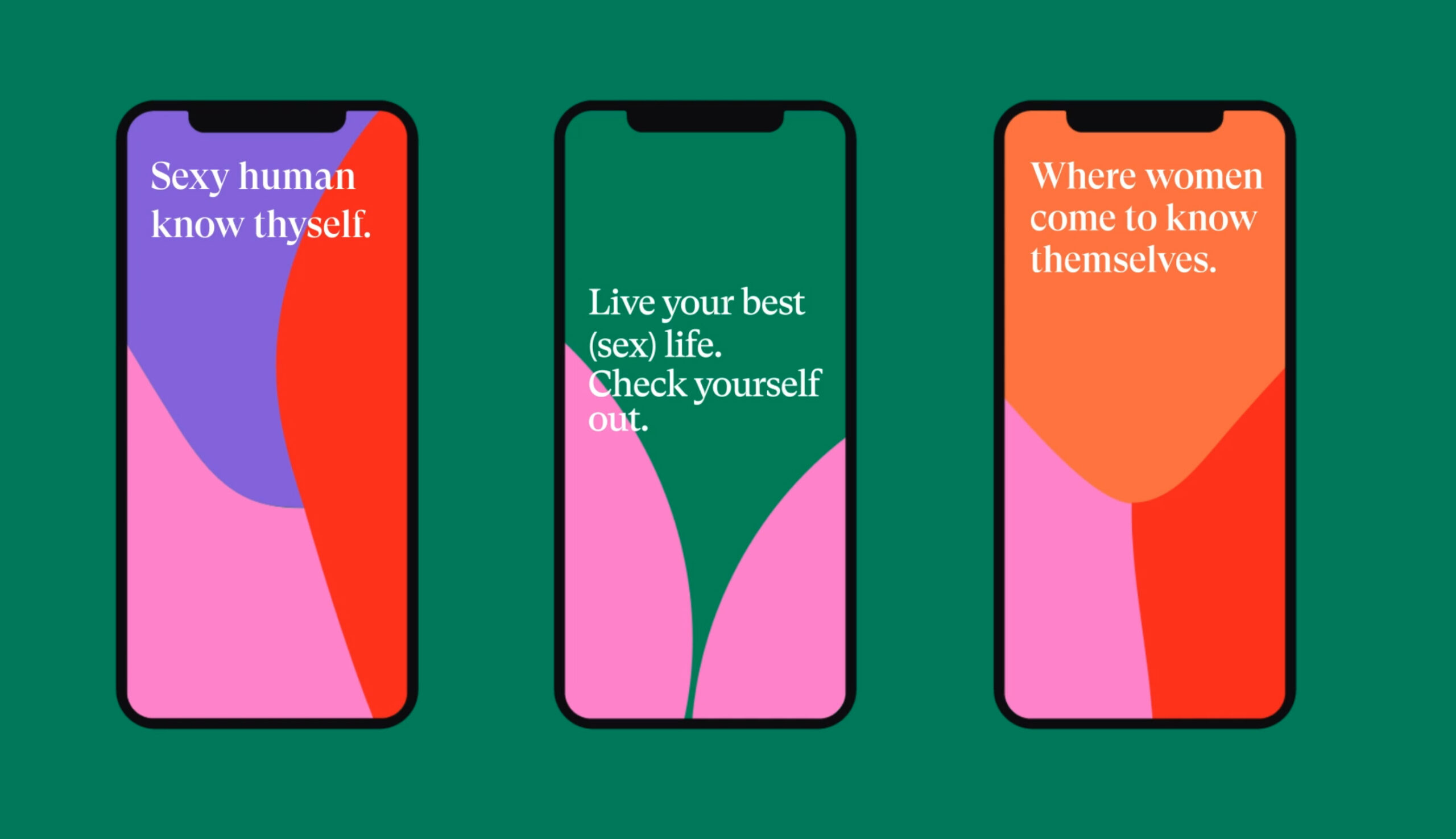
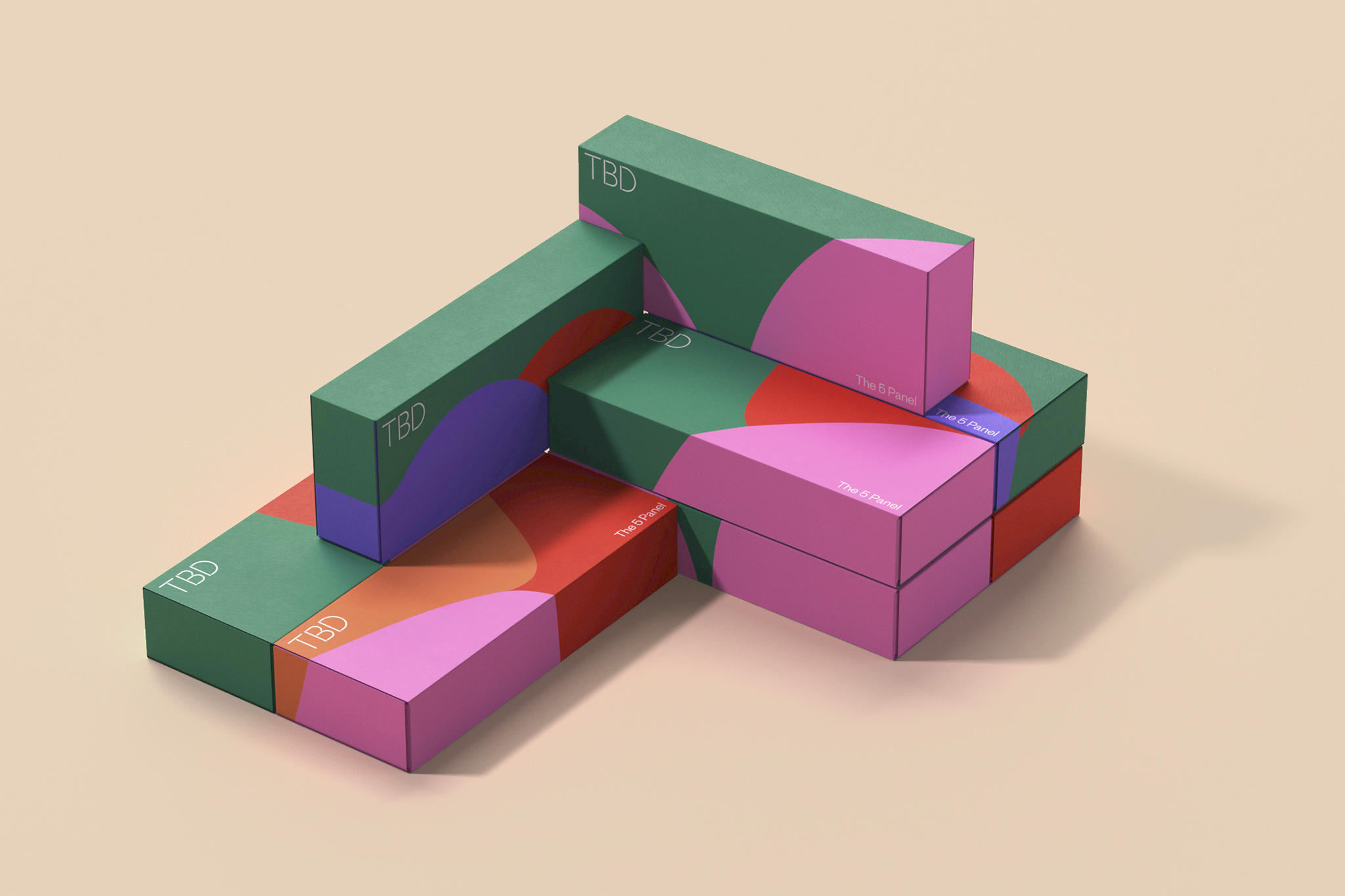
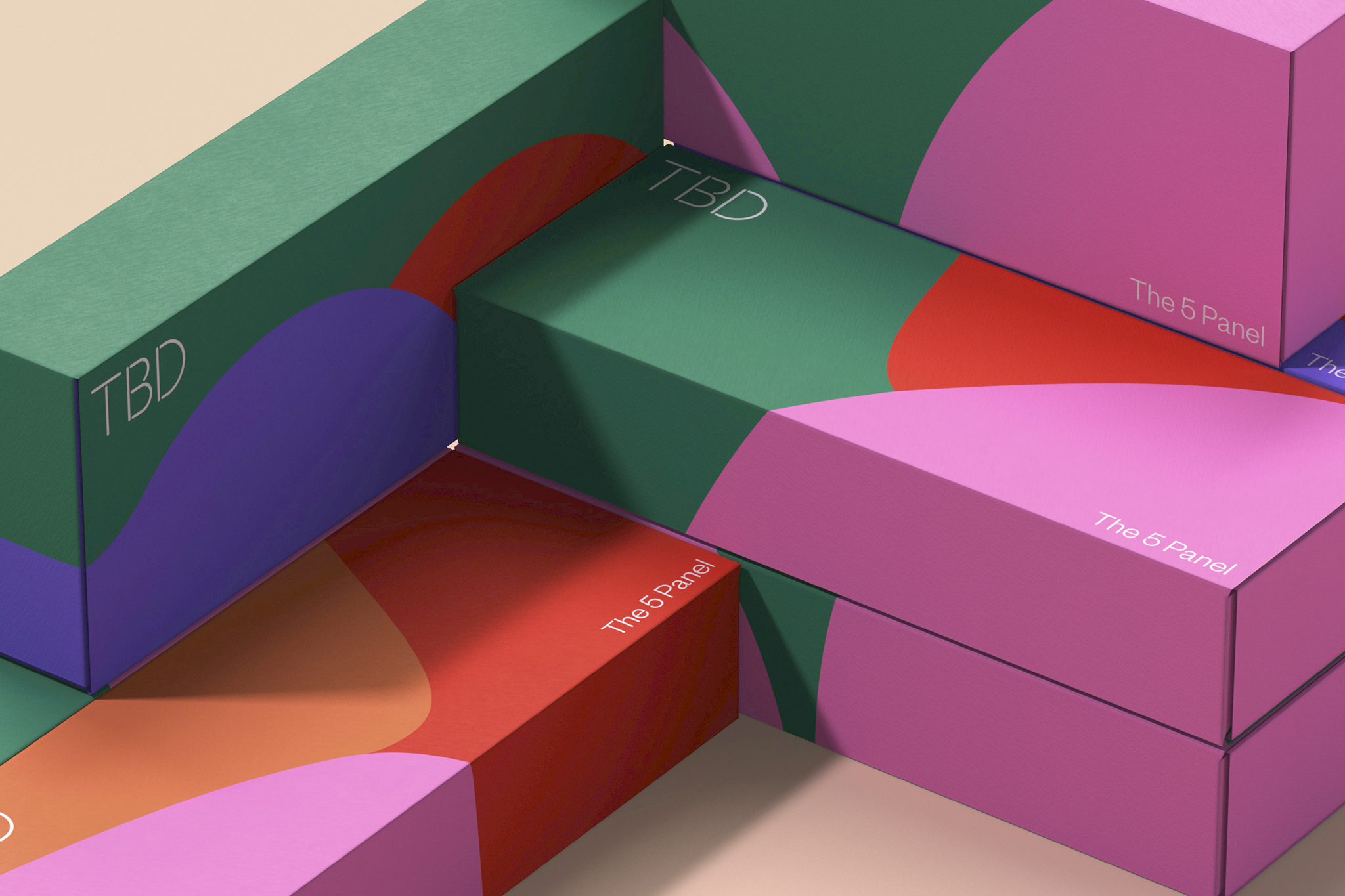
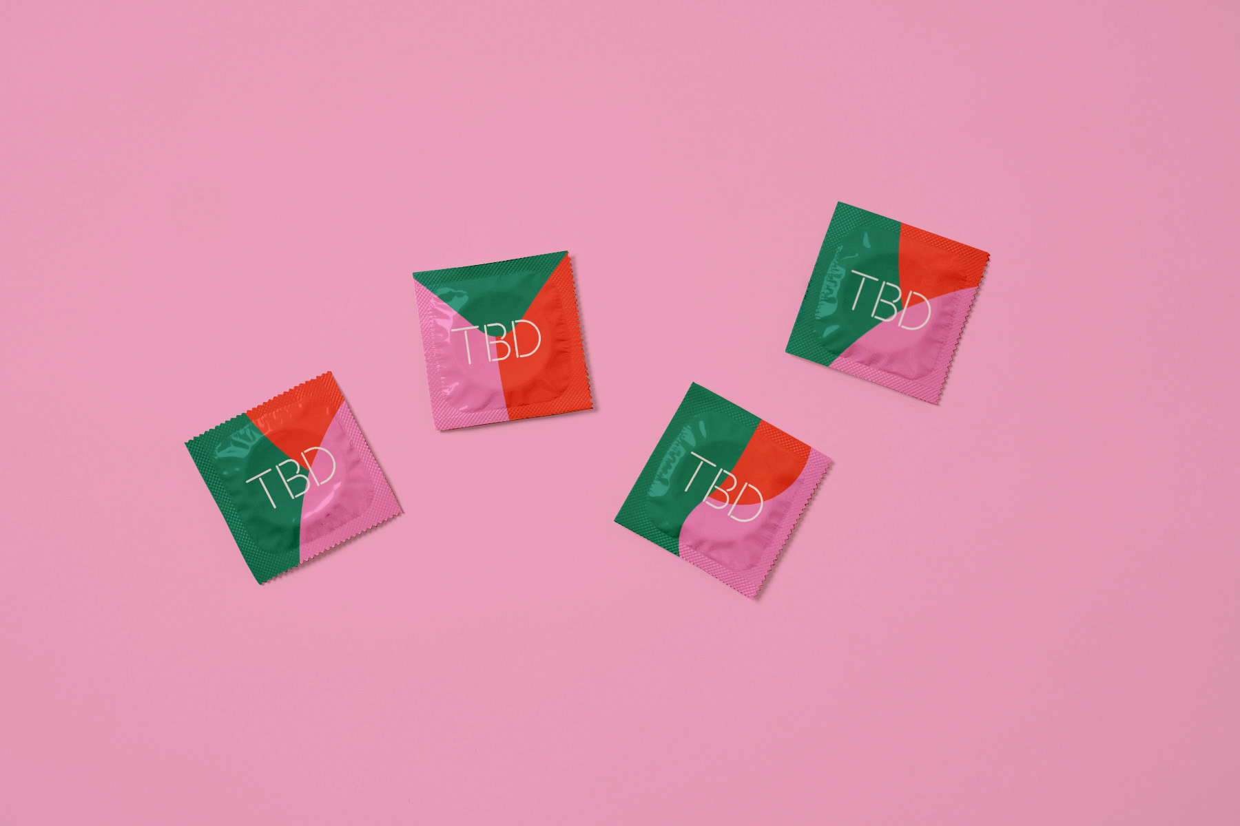
The visual language is based on the varied shapes of the female body, creating organic and suggestive patterns that generate a dynamic brand identity. The vivid, diverse colour palette transmits optimism and confidence.
The logotype is an understated bespoke stencil typography that complements the graphic system. The idea is to let the graphic system do the talking while the logotype remains in the background.