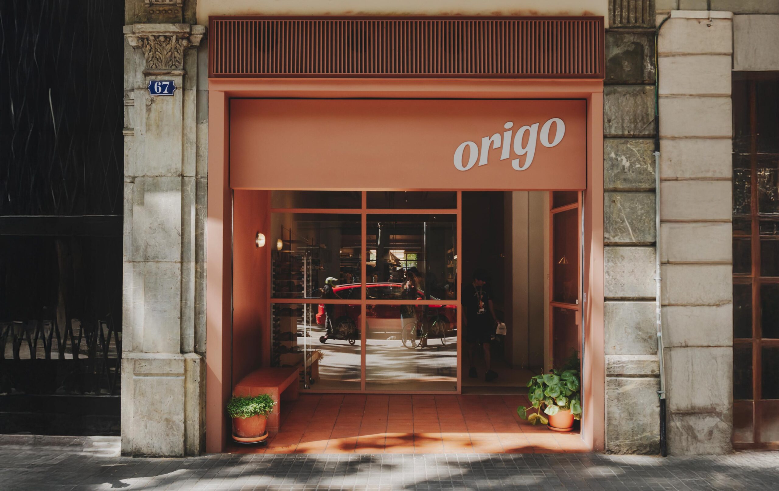
Bread leaves a trace, so does design
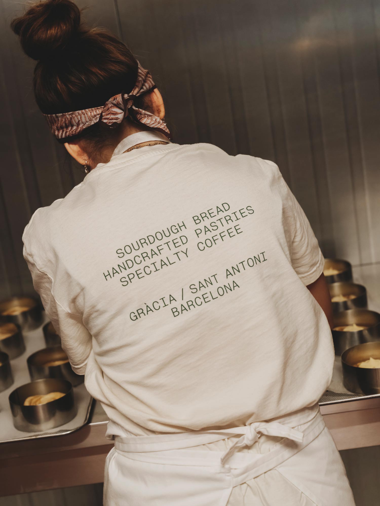
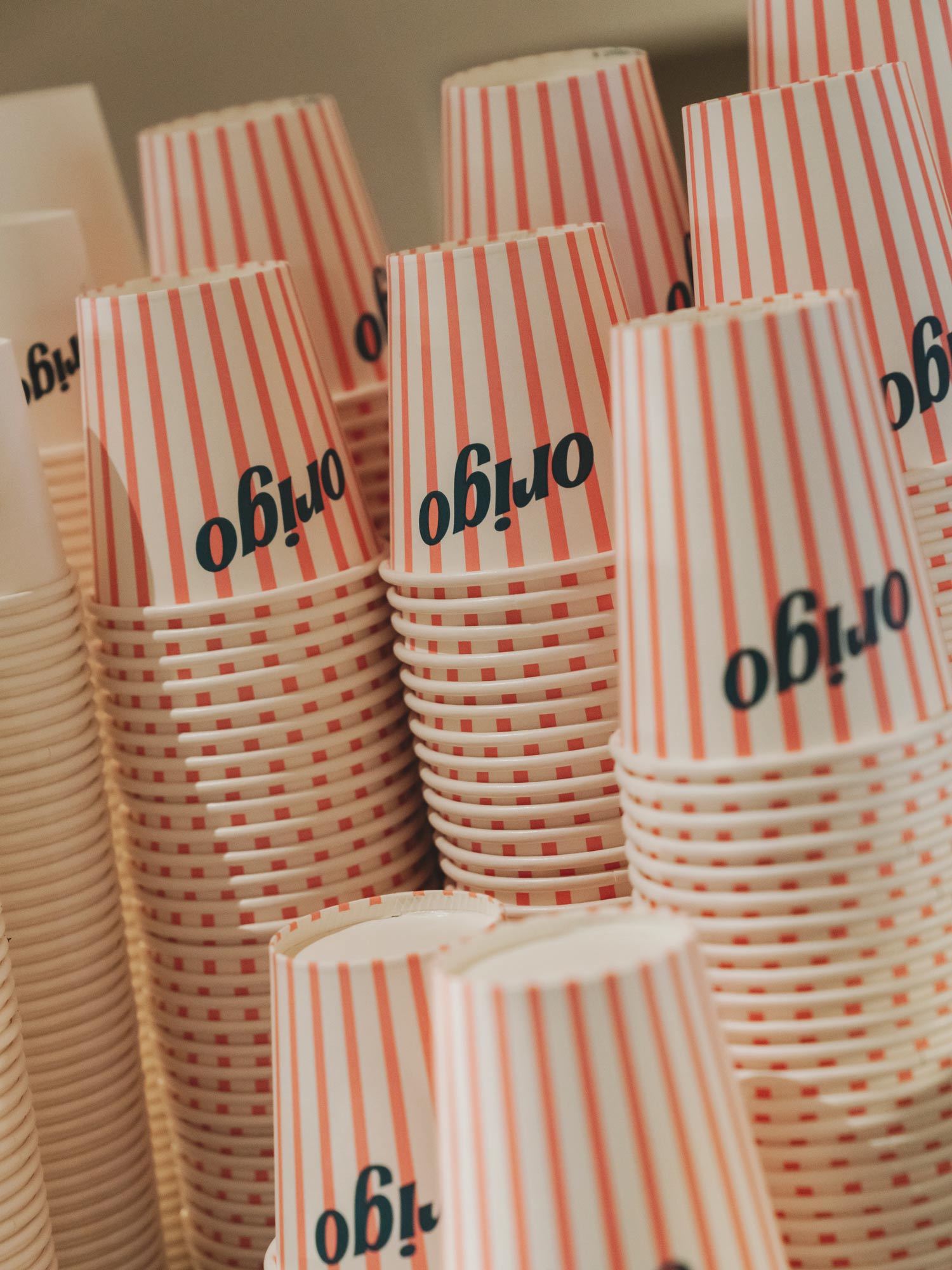
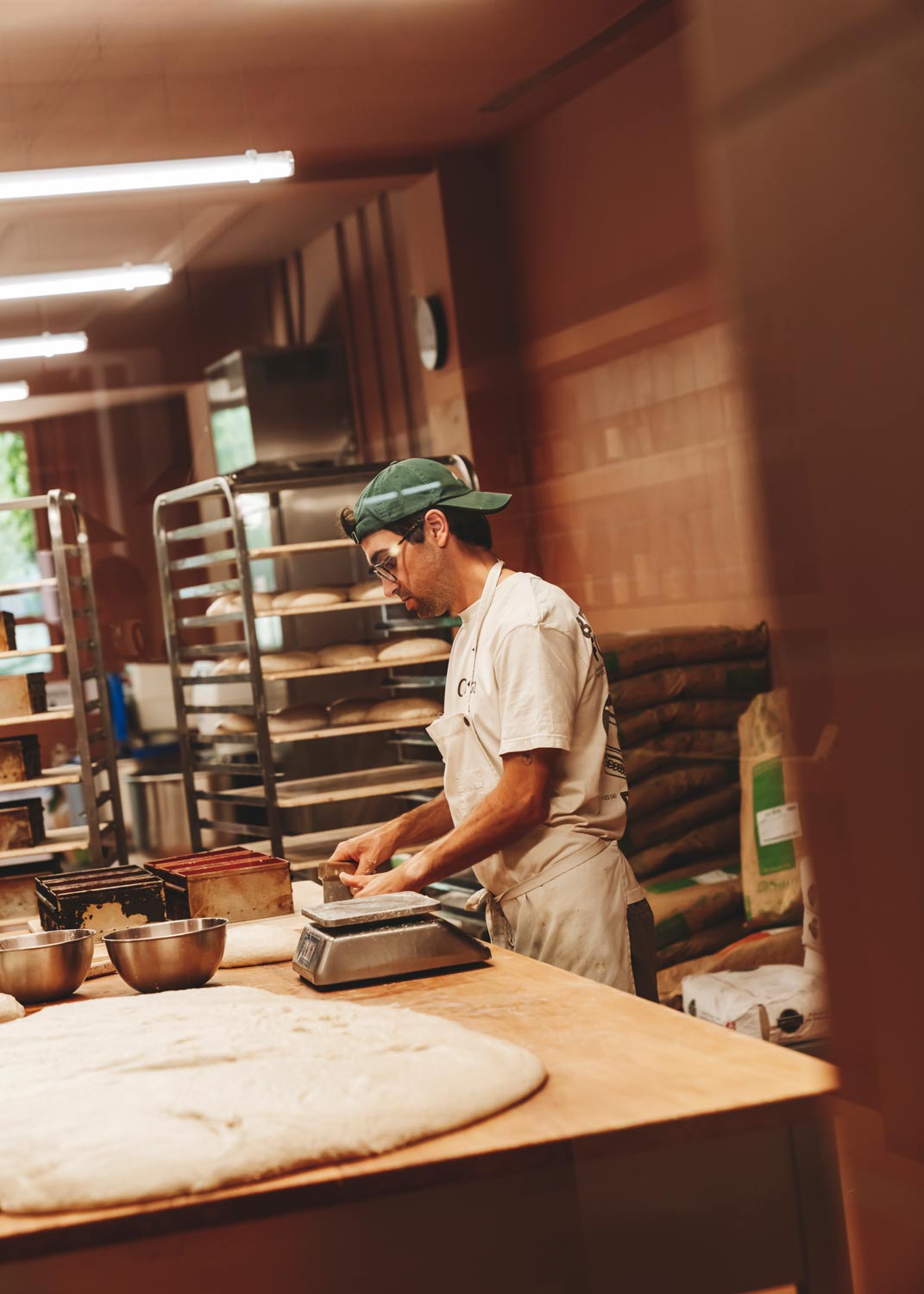
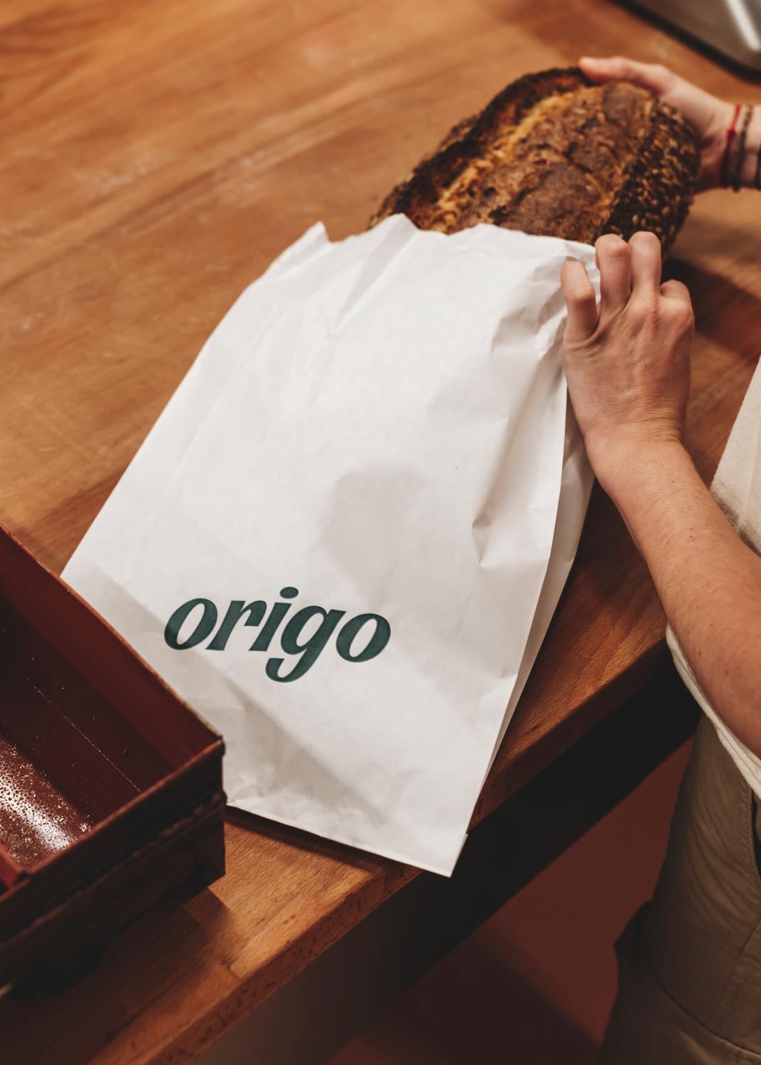
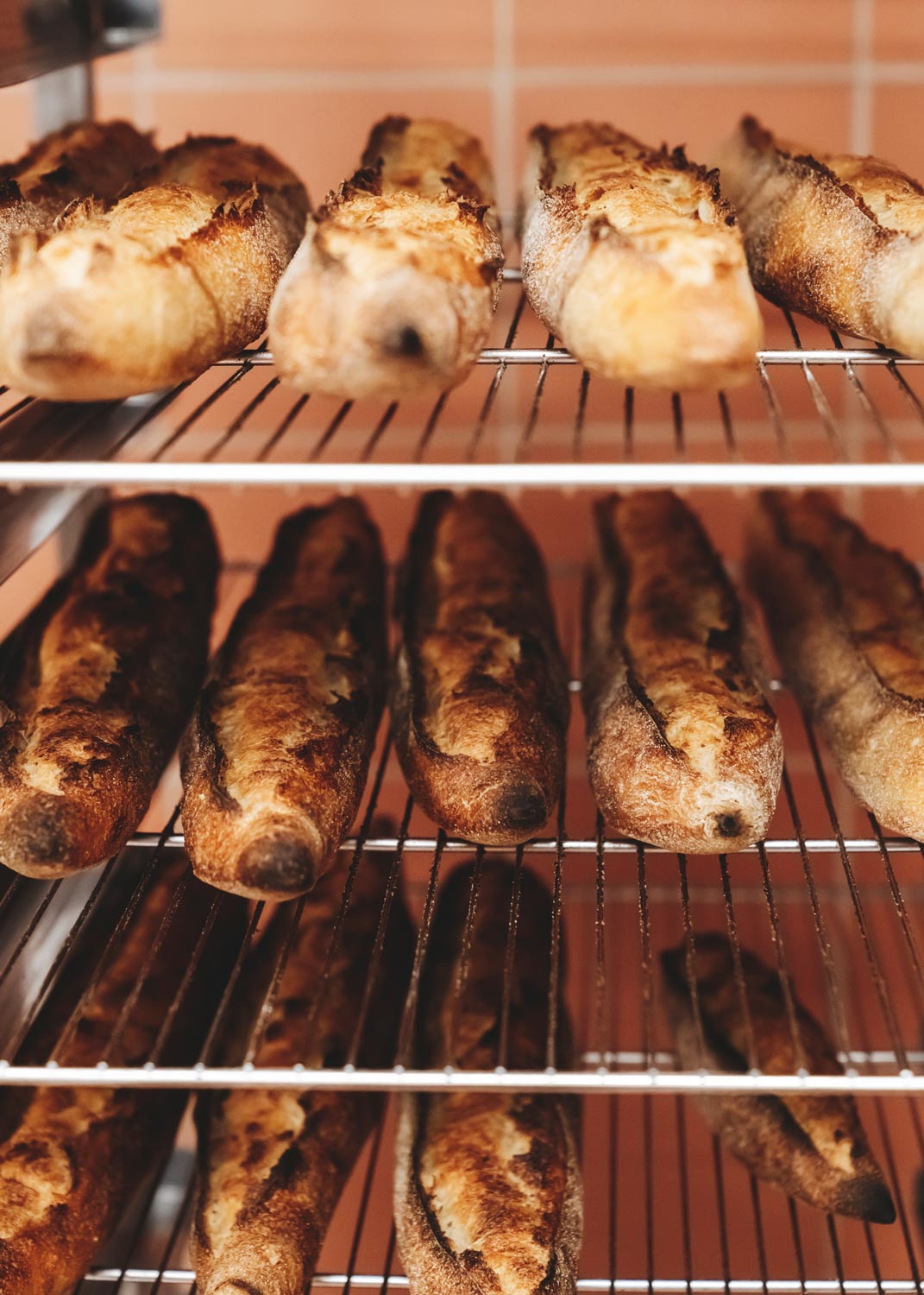
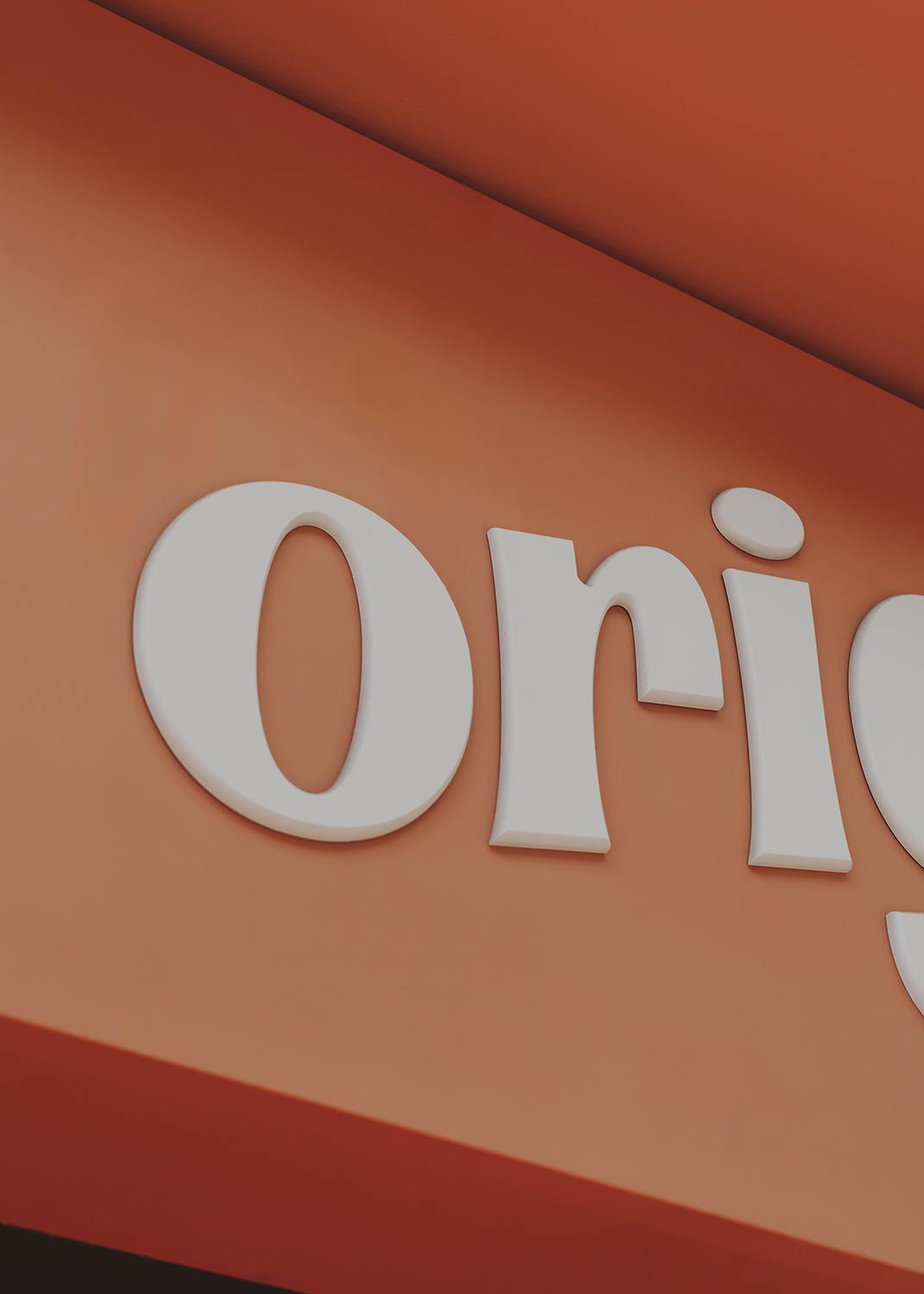
Creating a brand for a bakery like Origo meant staying close to what really matters: ingredients, process, and care. Origo refers to the origin, and that word became the foundation for a graphic system that feels handmade, approachable, and quietly confident.
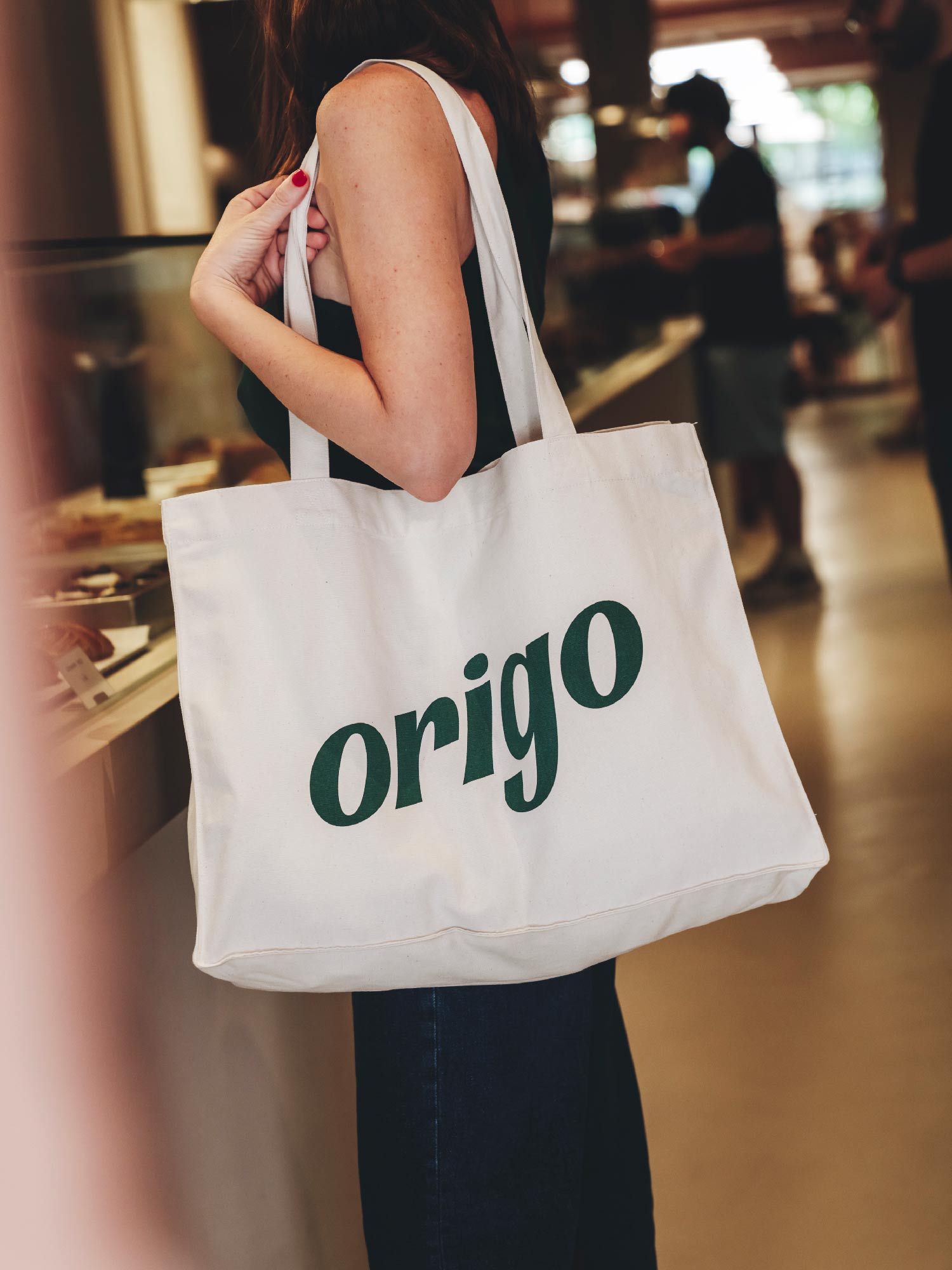
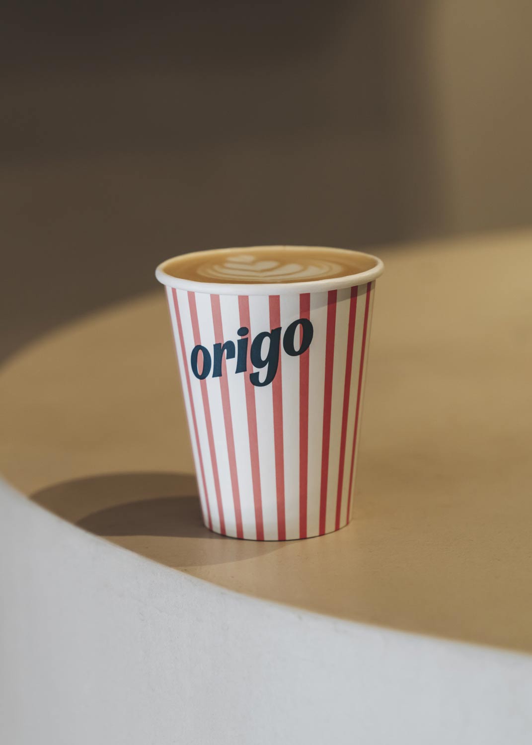
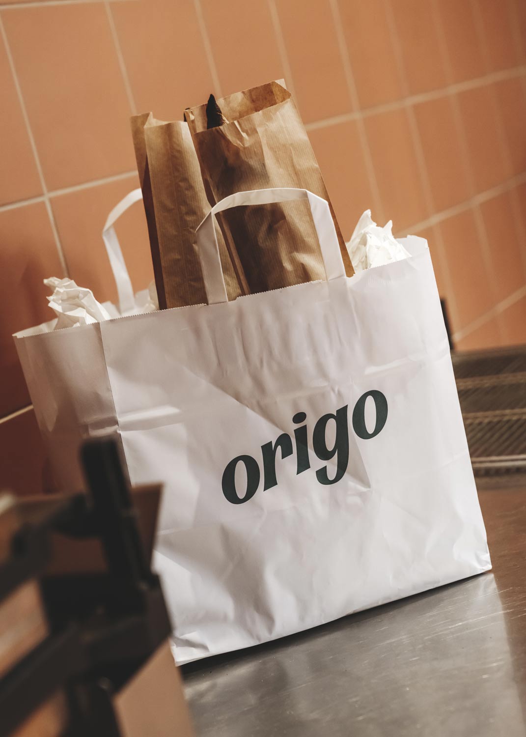
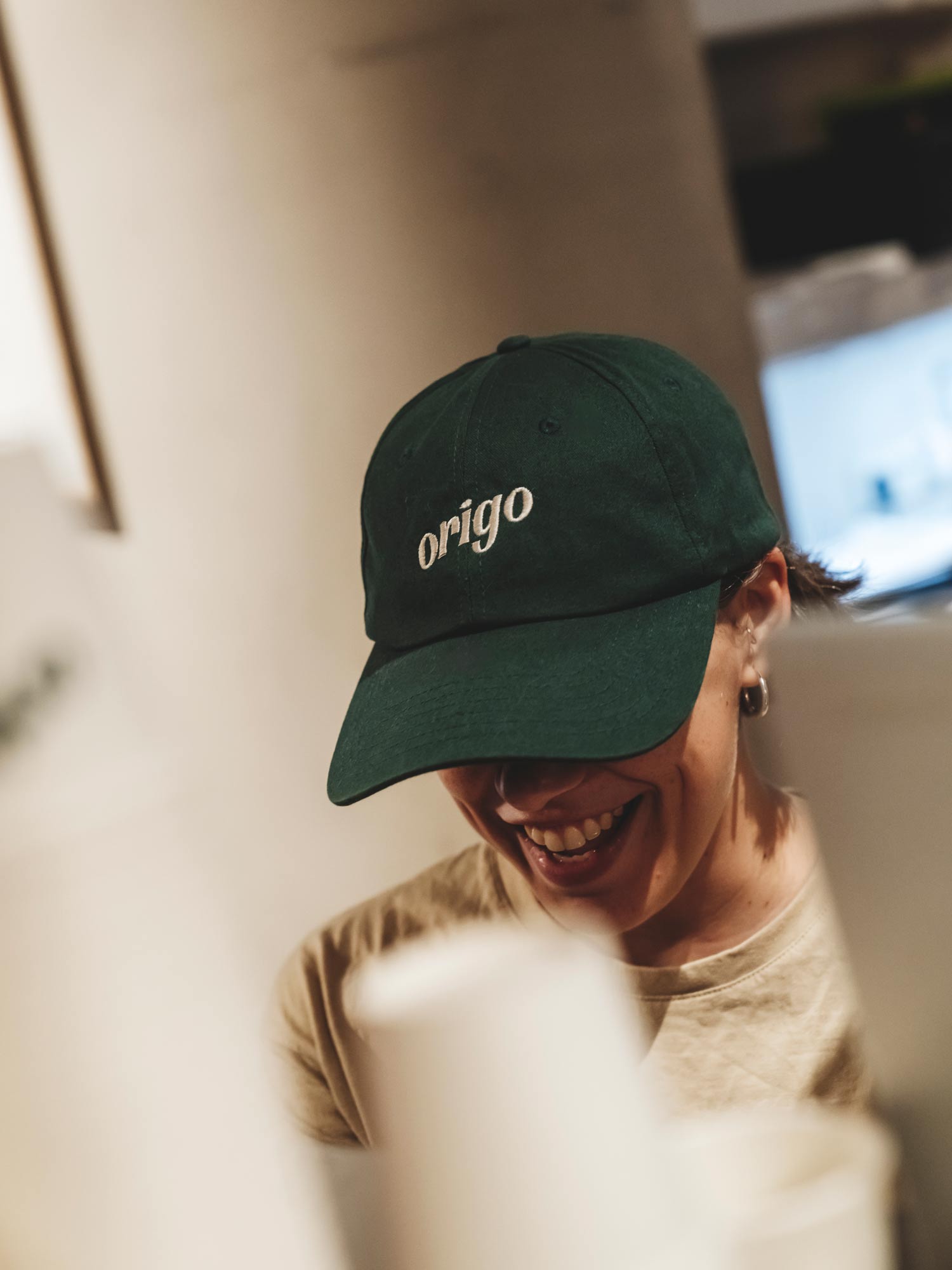
The logo is a custom wordmark with soft curves and subtle rhythm, drawn to feel like something shaped by hand, not software. No extras, no shortcuts. Just gesture, proportion, and intention.
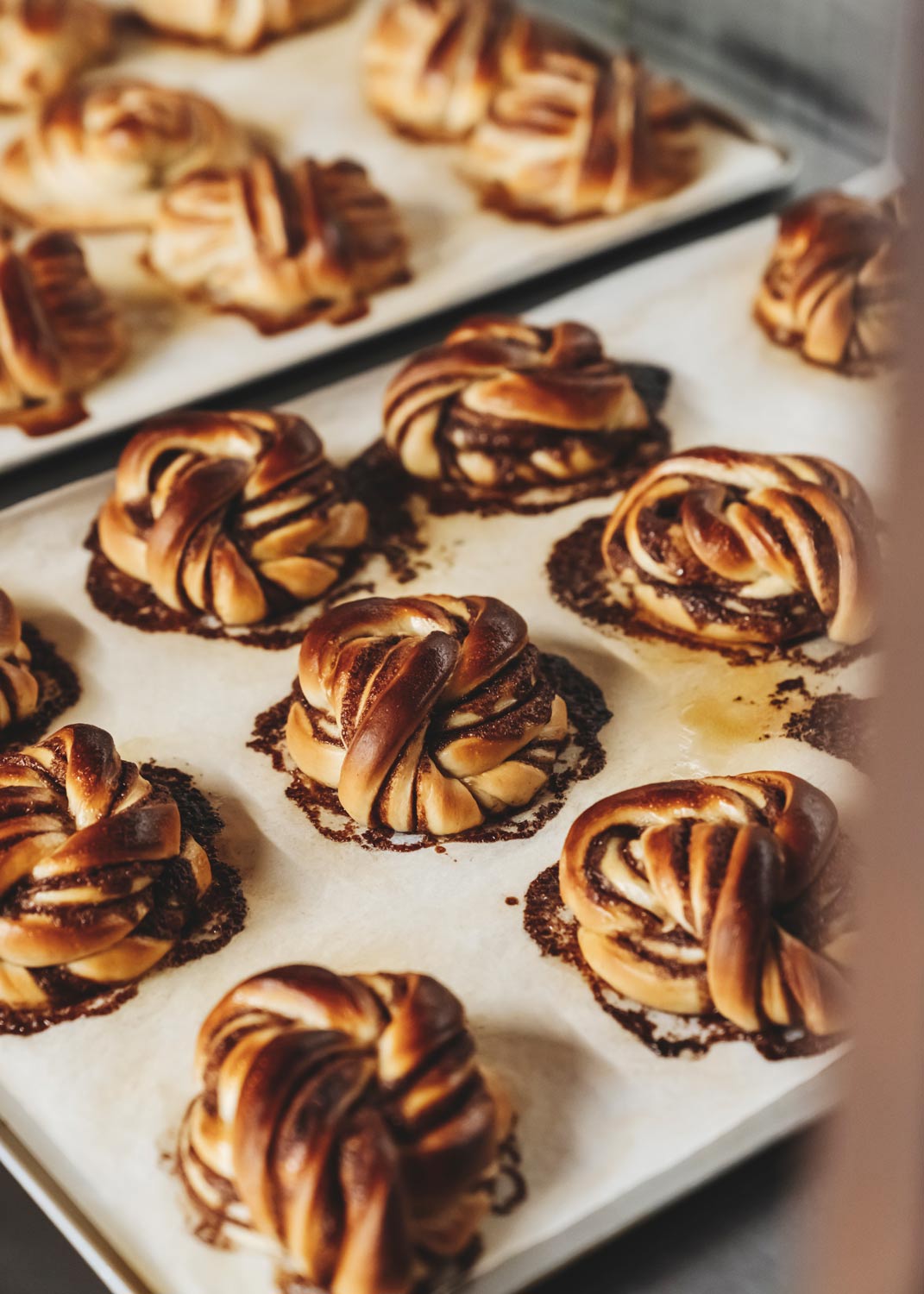
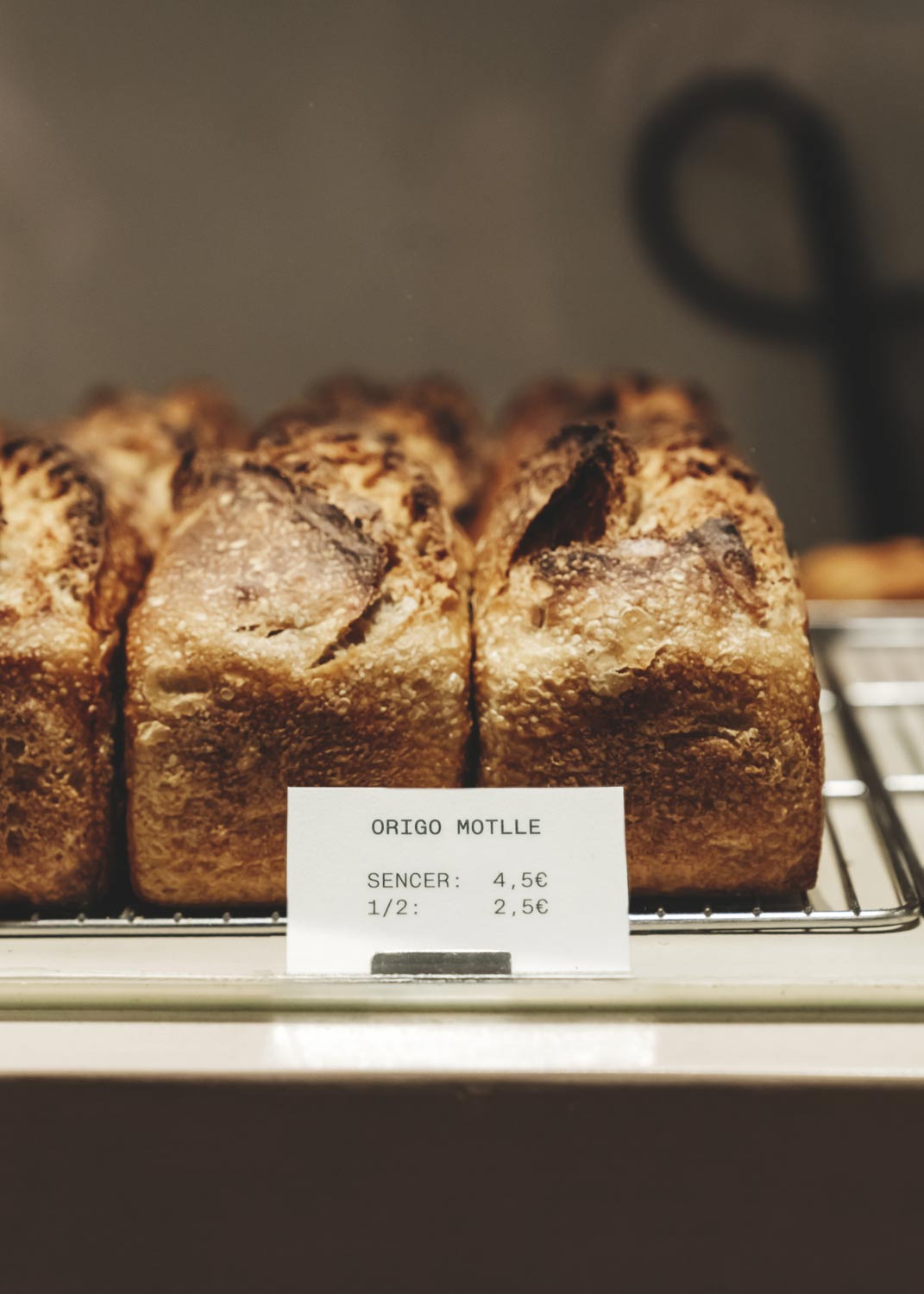
The visual language expands naturally: warm terracotta, raw textures, clean layouts and playful stripes reflect the sensory world of fresh bread and slow mornings. The result is an identity that feels baked, not built.
Lettering design by YaniGuille&Co.
Interior design by Isern Serra.