Laus 2010
Shaping design excellence
Client
ADG-FAD
Services
Industry
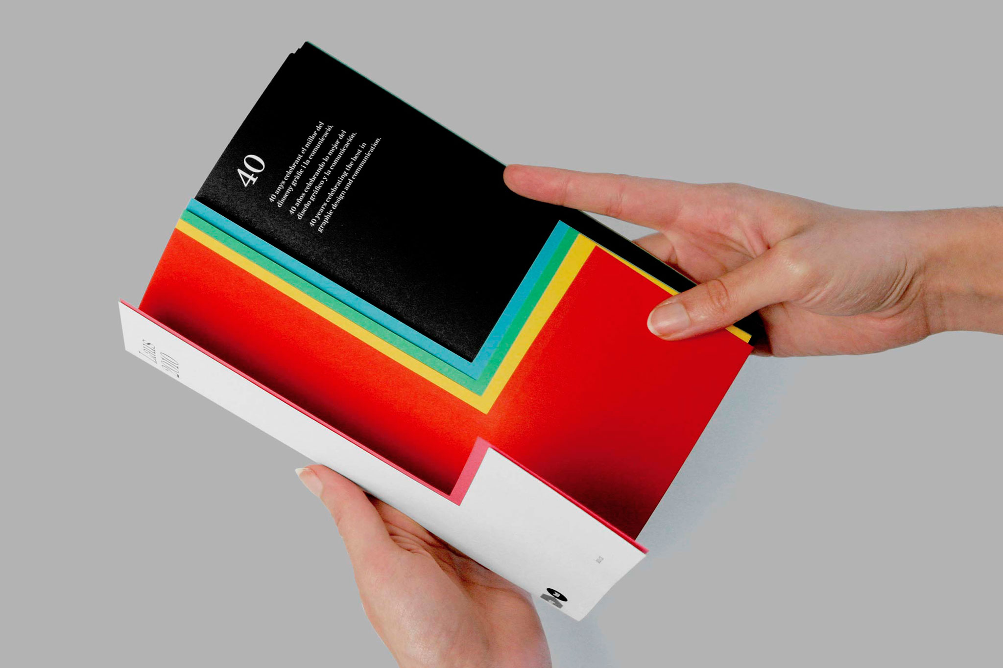
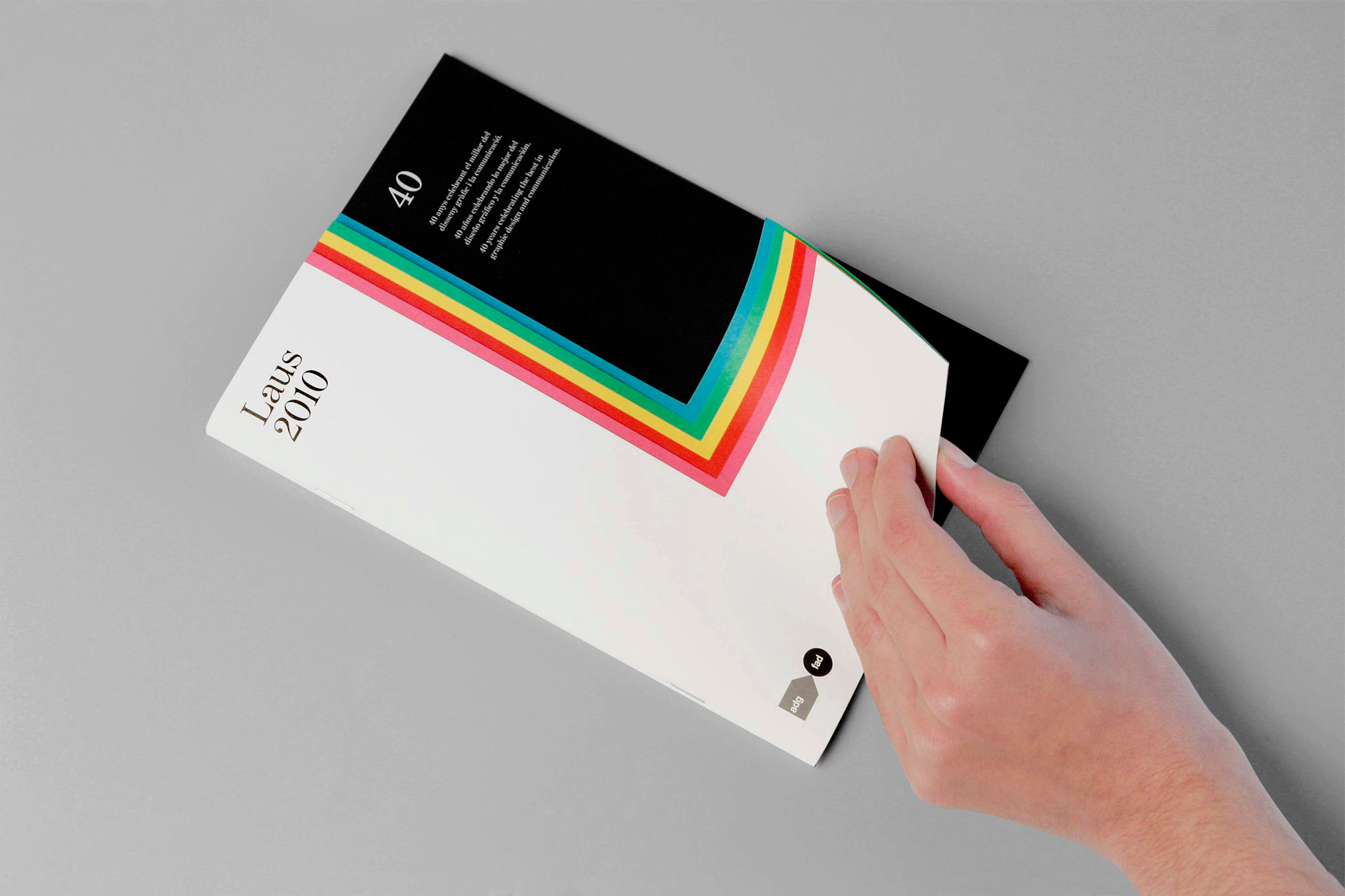
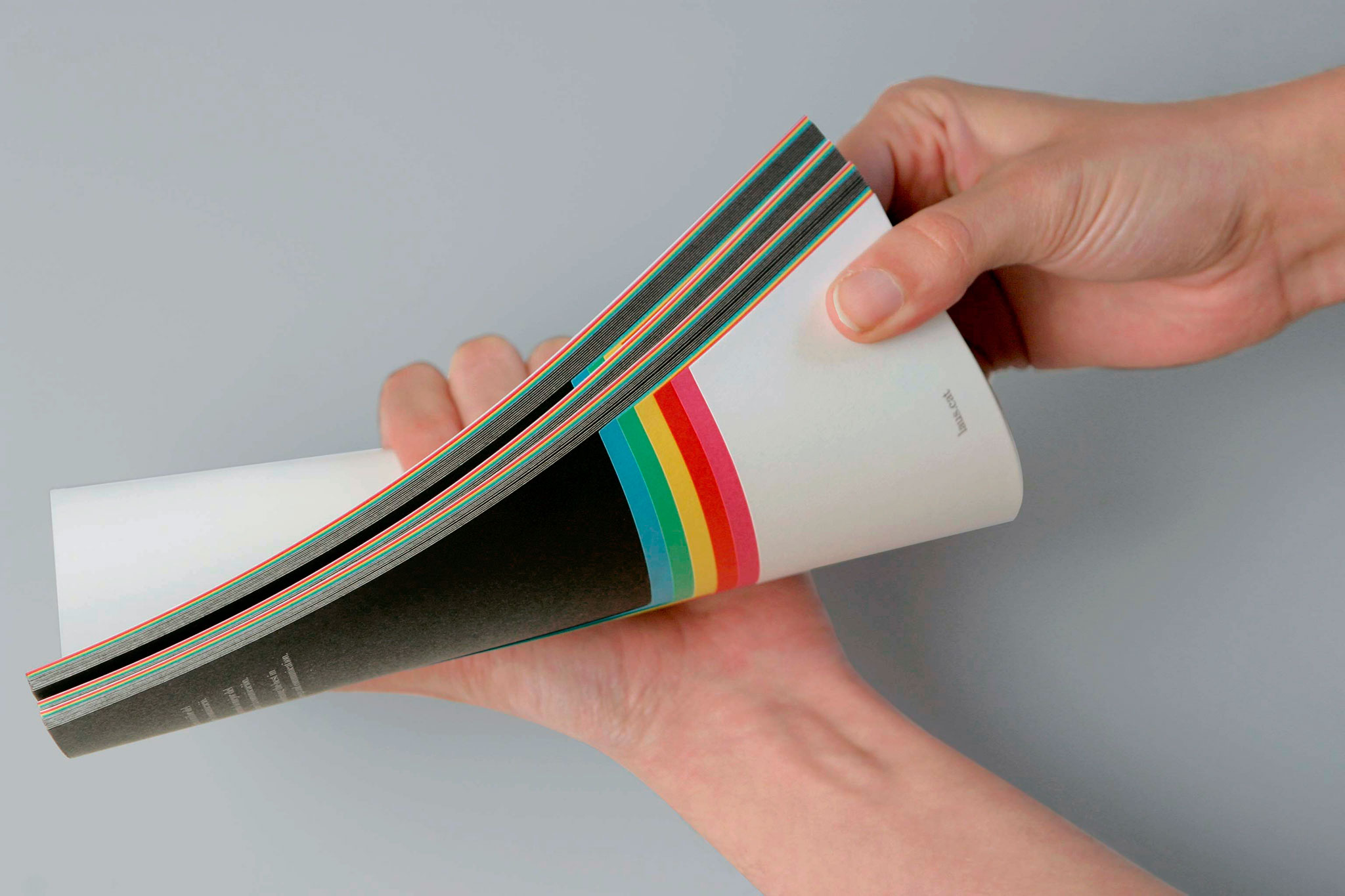
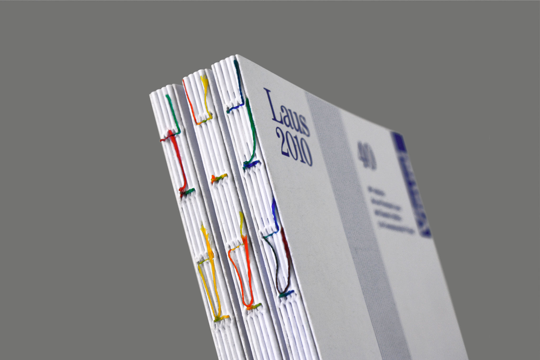
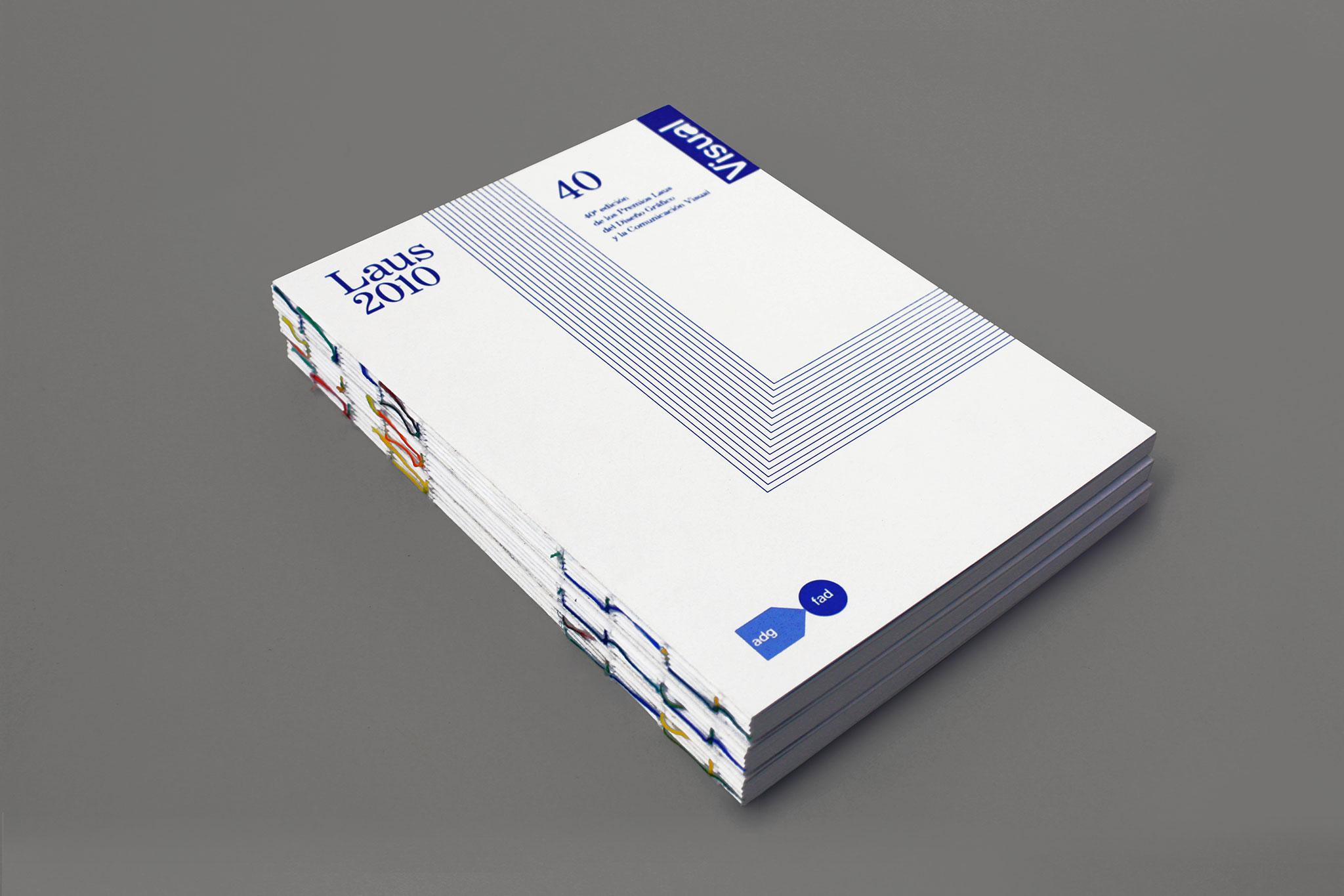
Revitalizing the identity of Laus Design Awards at its 40th milestone
Identity of the Spanish Laus Design Awards which turned 40 in 2010. When we were initially asked to design the campaign, we could not believe it — for us it was a real challenge to design something for designers because all eyes would be on our design. We created an abstract campaign that reflected the passing of time. The “L” that stands for “Laus” was represented in different color paper sheets in the shape of a die.
Client
ADG-FAD
Services
Industry