Amplifying words: redefining the Kosmopolis literature festival through visual branding and communication
Kosmopolis is a biennial literature festival that has been organized by the Centre de Cultura Contemporània de Barcelona since 2002. The duration of the festival itself is five days but an ongoing programme keeps the spirit of the event alive all year round. The event promotes a concept of amplified literature in many different forms and brings together different types of professionals to discuss the key issues that concern literature today.
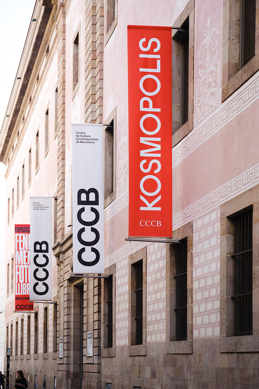
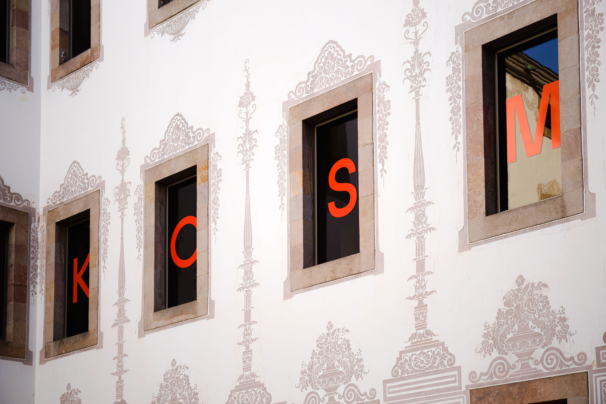
Hey was commissioned to visually rebrand Kosmopolis as well as to work on the identity and communication campaign for 2017 edition. In keeping with the visual identity of past editions, we decided to establish red as the main color. We also created a specially made typography.
Words are the essence of festival and we wanted to give them some character.
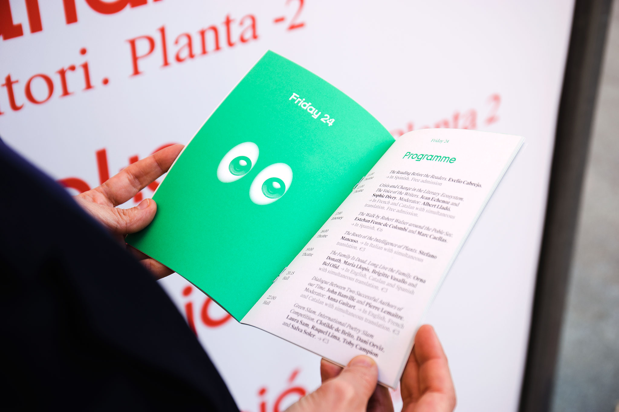
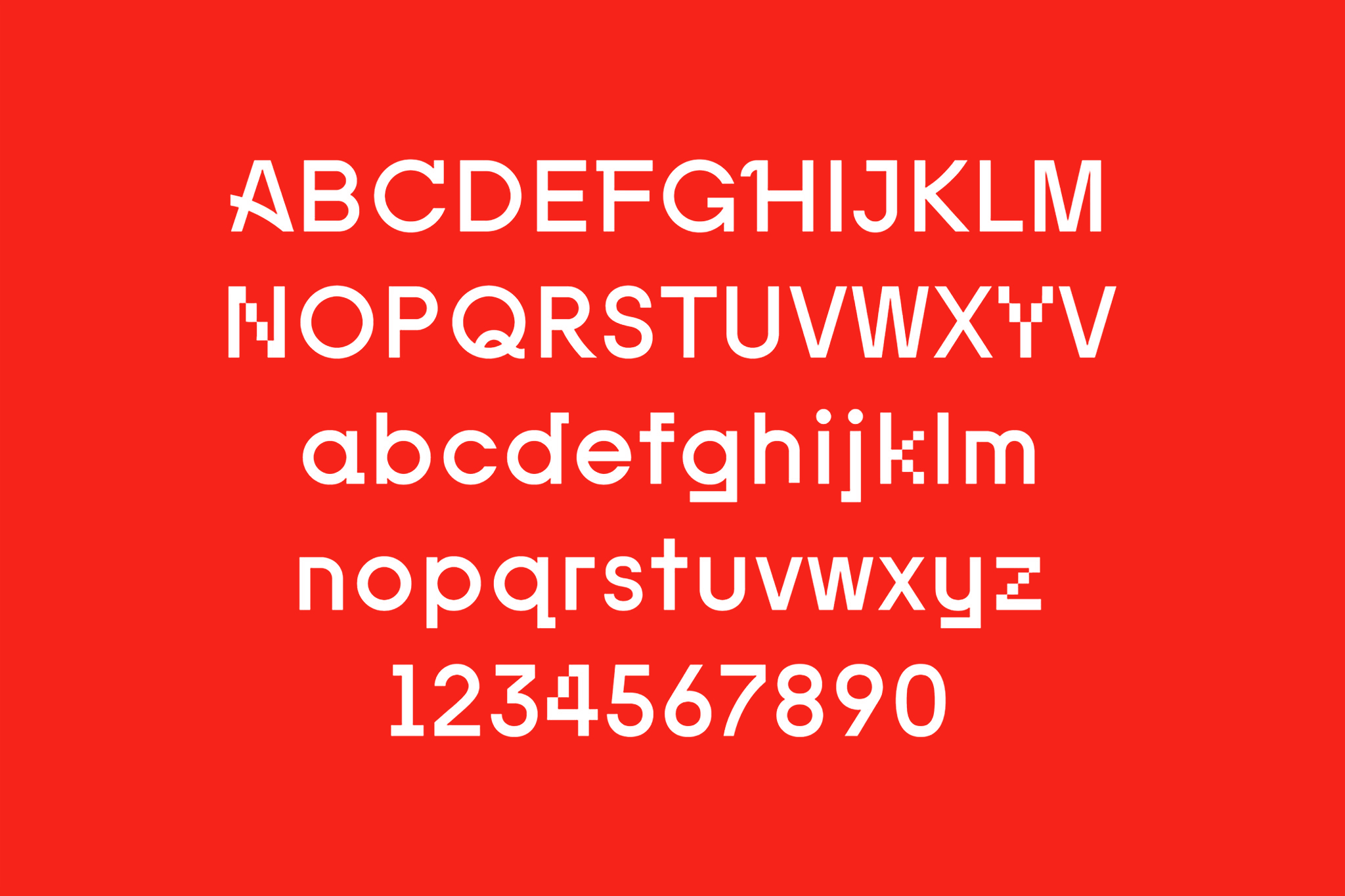
We came up with a typeface based on the multidisciplinary nature of the festival. It was applied to the logo, the short version logo for each edition (the K plus the year) and other display applications. Each character was created according to common parameters. We then customized the stroke on some of them. Each stroke intervention directly refers to a specific use of the word: digital words, hand-written words, painted words. This made-to-measure typeface gave the festival personality and a brand image.
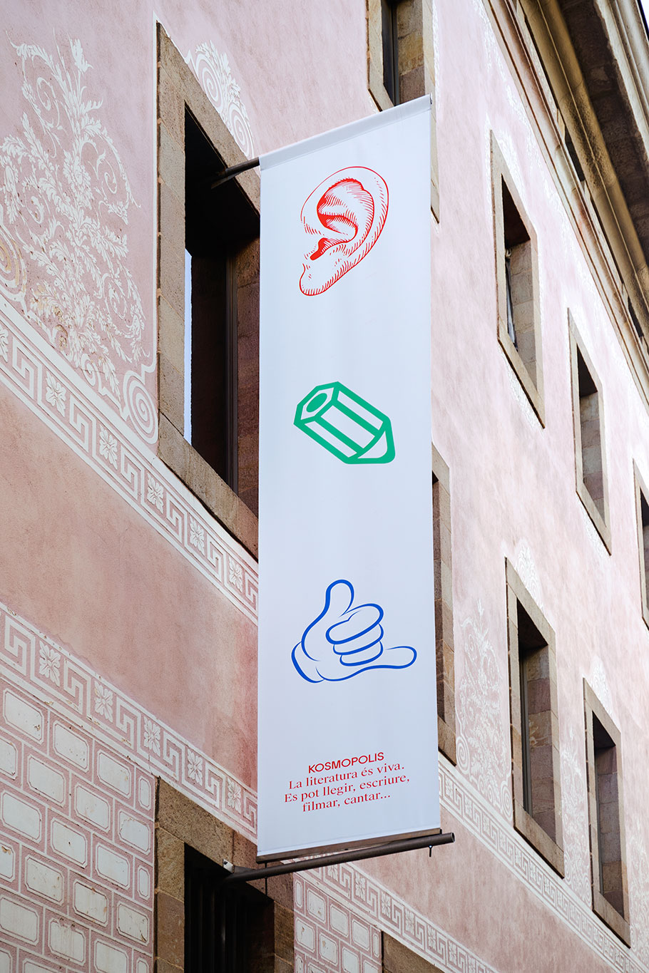
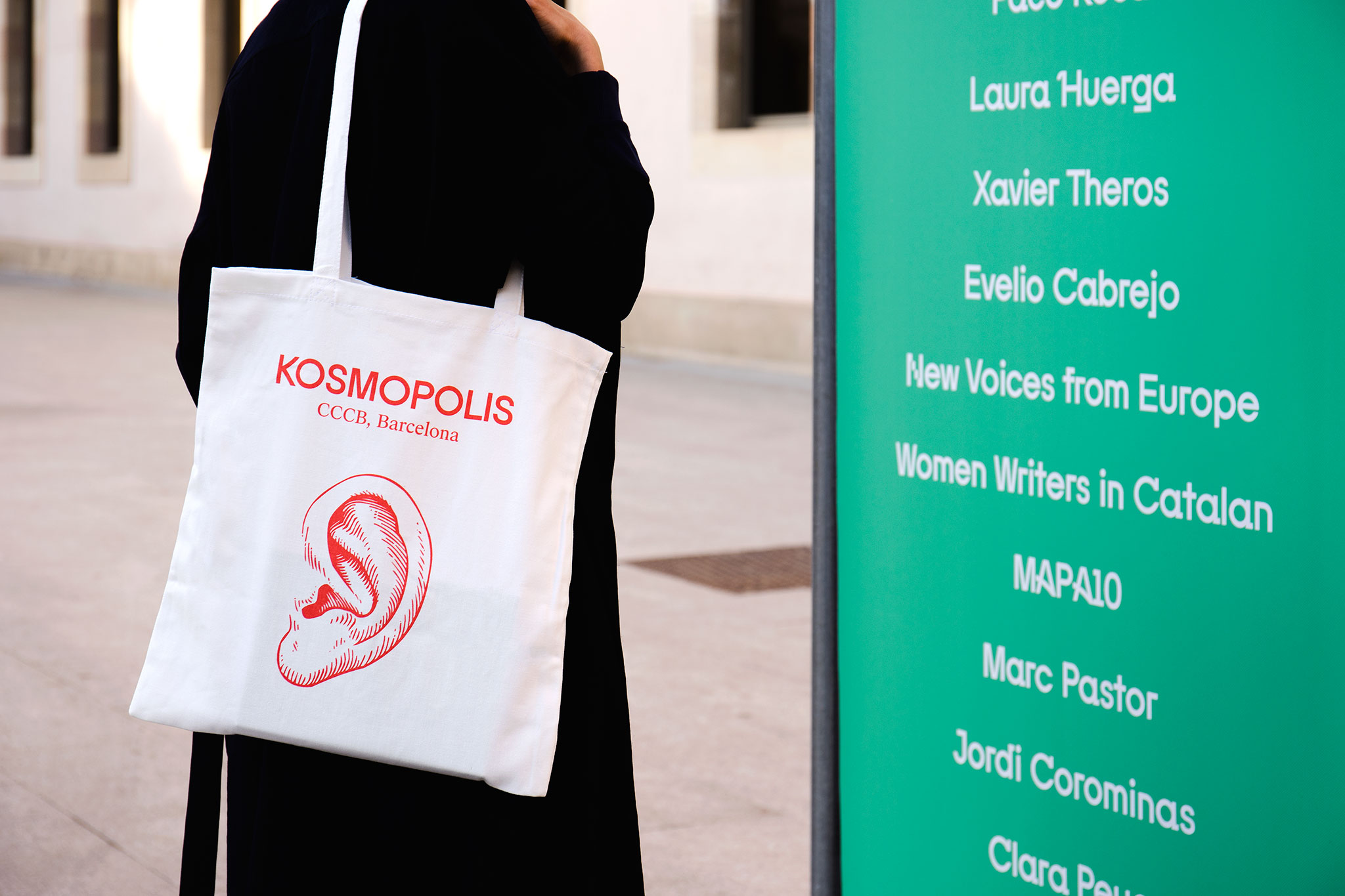
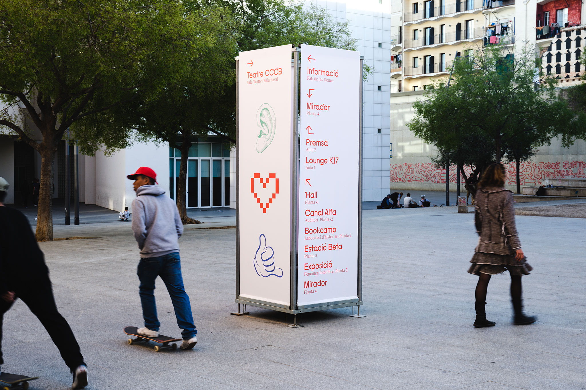
For the 2017 communications campaign we worked visually on a concept from the strategic communications agency Usted. We created an icon series that put together pictograms of different styles to reinforce the varied nature of the festival.