Crafted Beers that Embrace Russian Heritage while Pioneering New Flavors
Dreamteam Brew is a brewery based in St. Petersburg and Moscow that wants to enrich classic recipes to create a world-class beer in Russia.
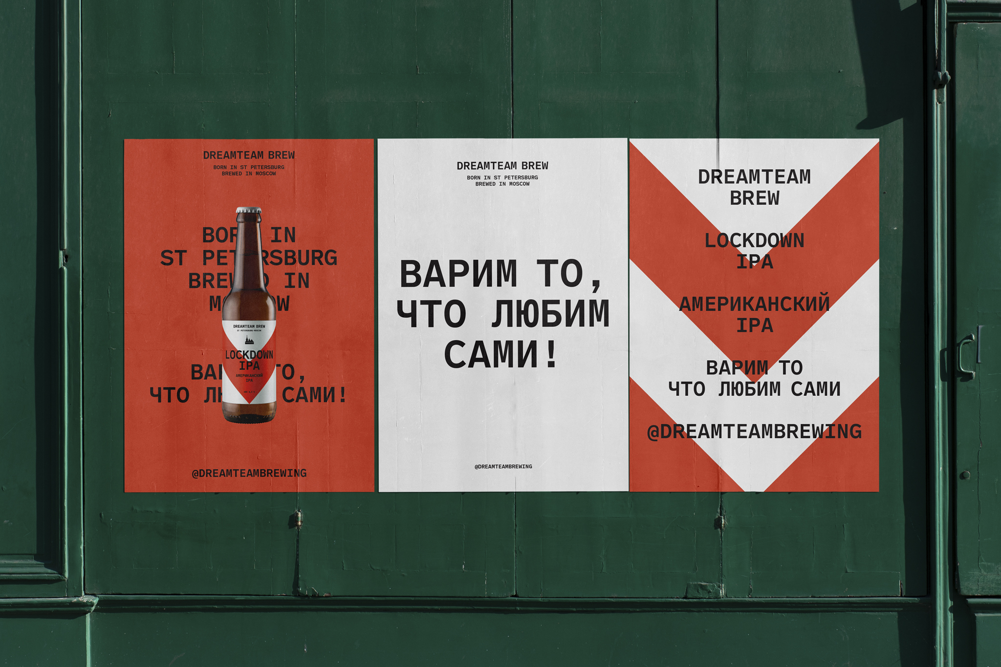
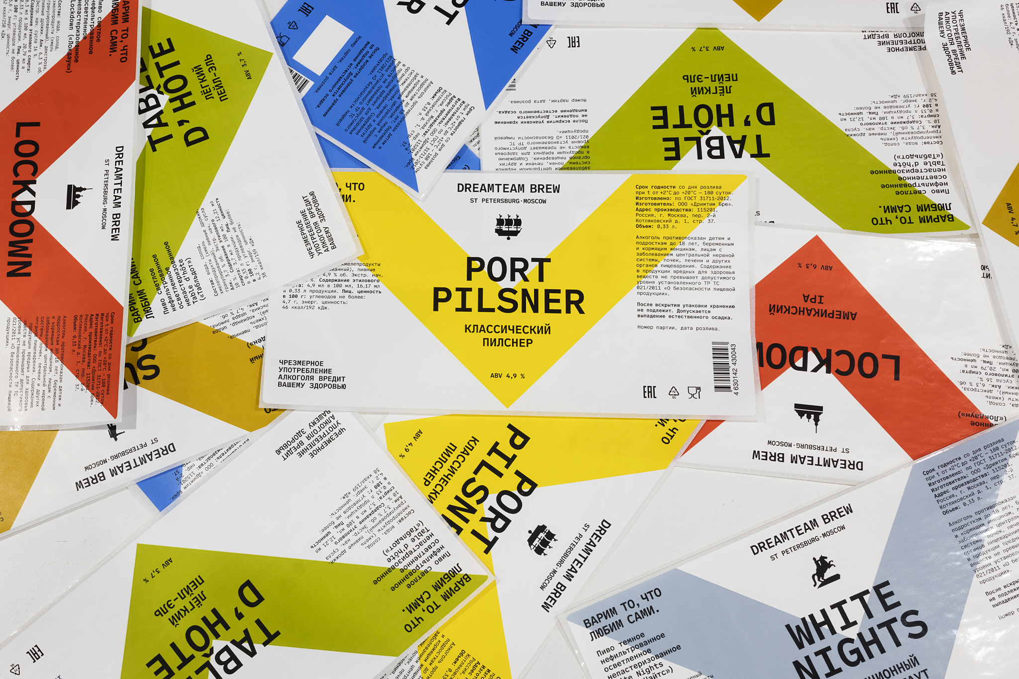
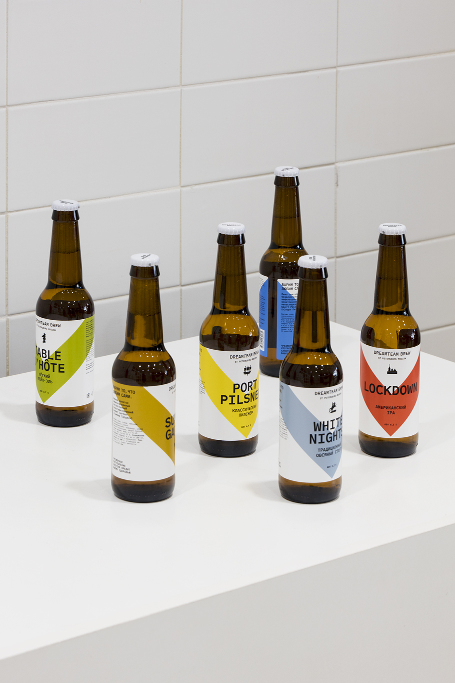
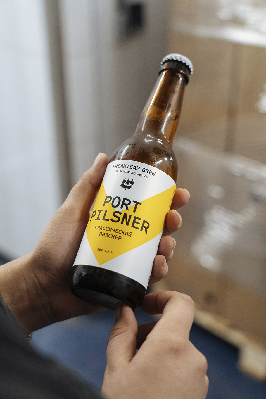
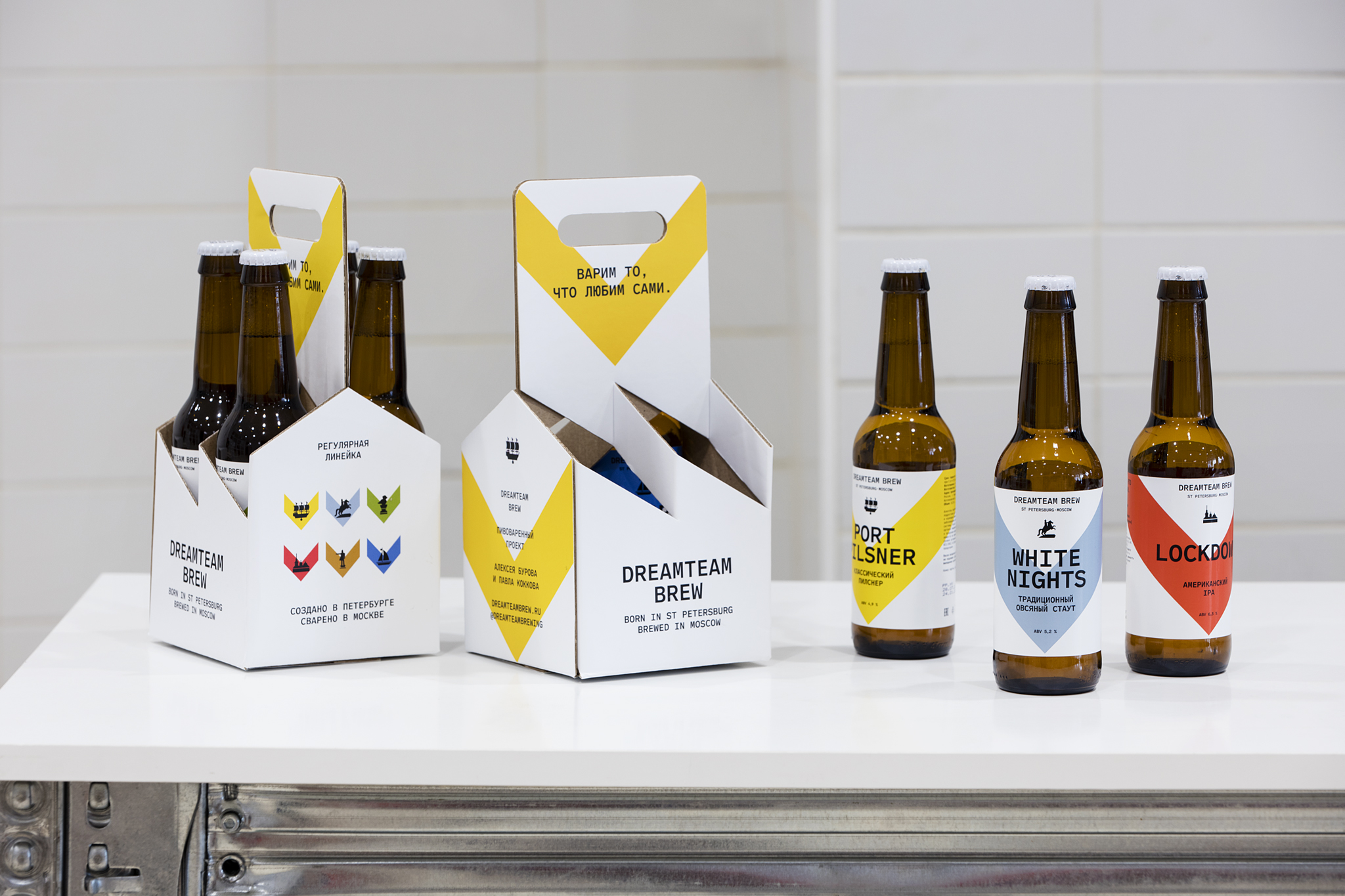
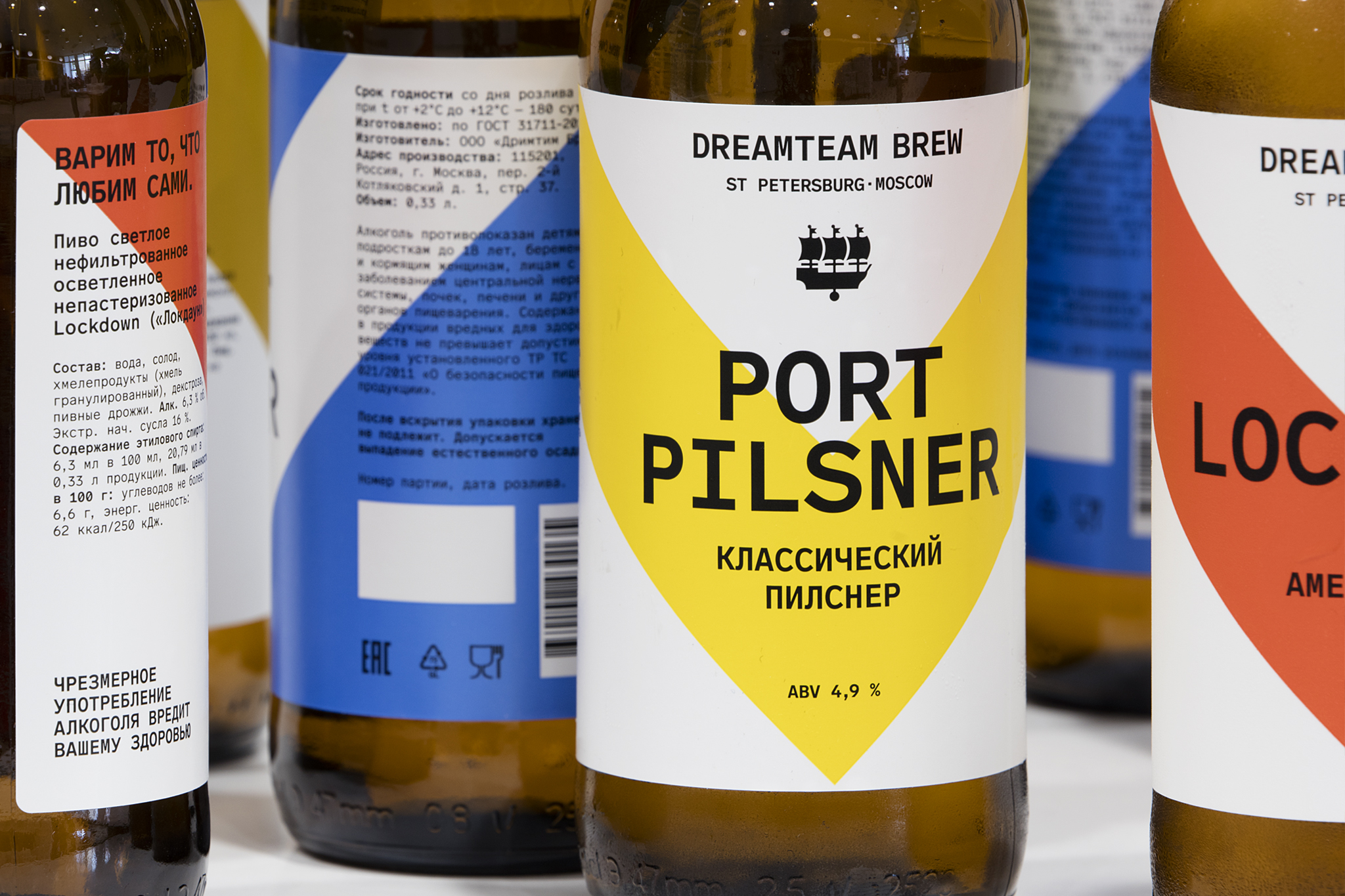
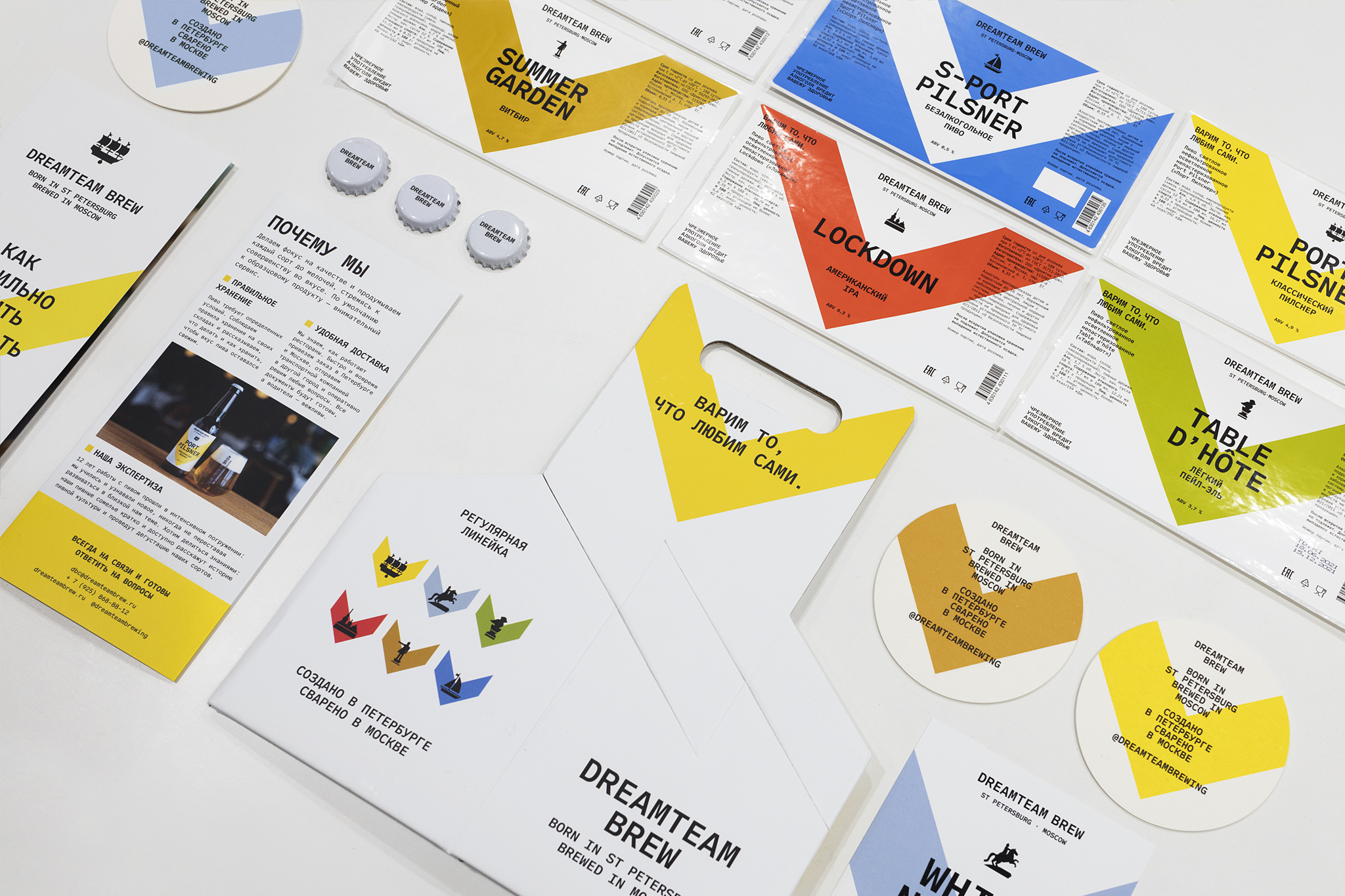
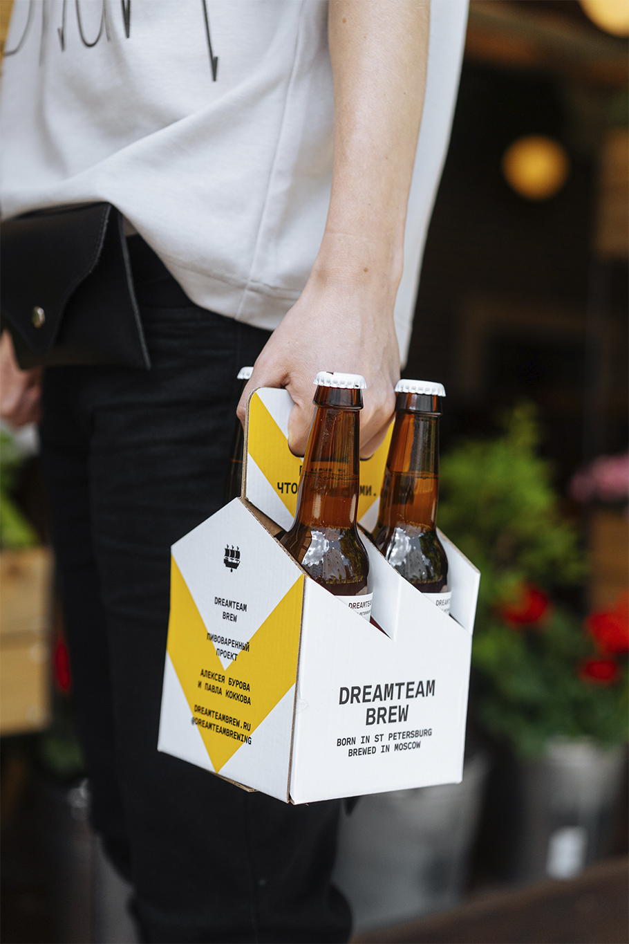
The brand is well established in restaurants throughout Russia’s major cities and wanted to retain some aspects of its old label design to remain easily recognisable: the ‘V’ shape, the origin story, the pictograms and the names of the beers.
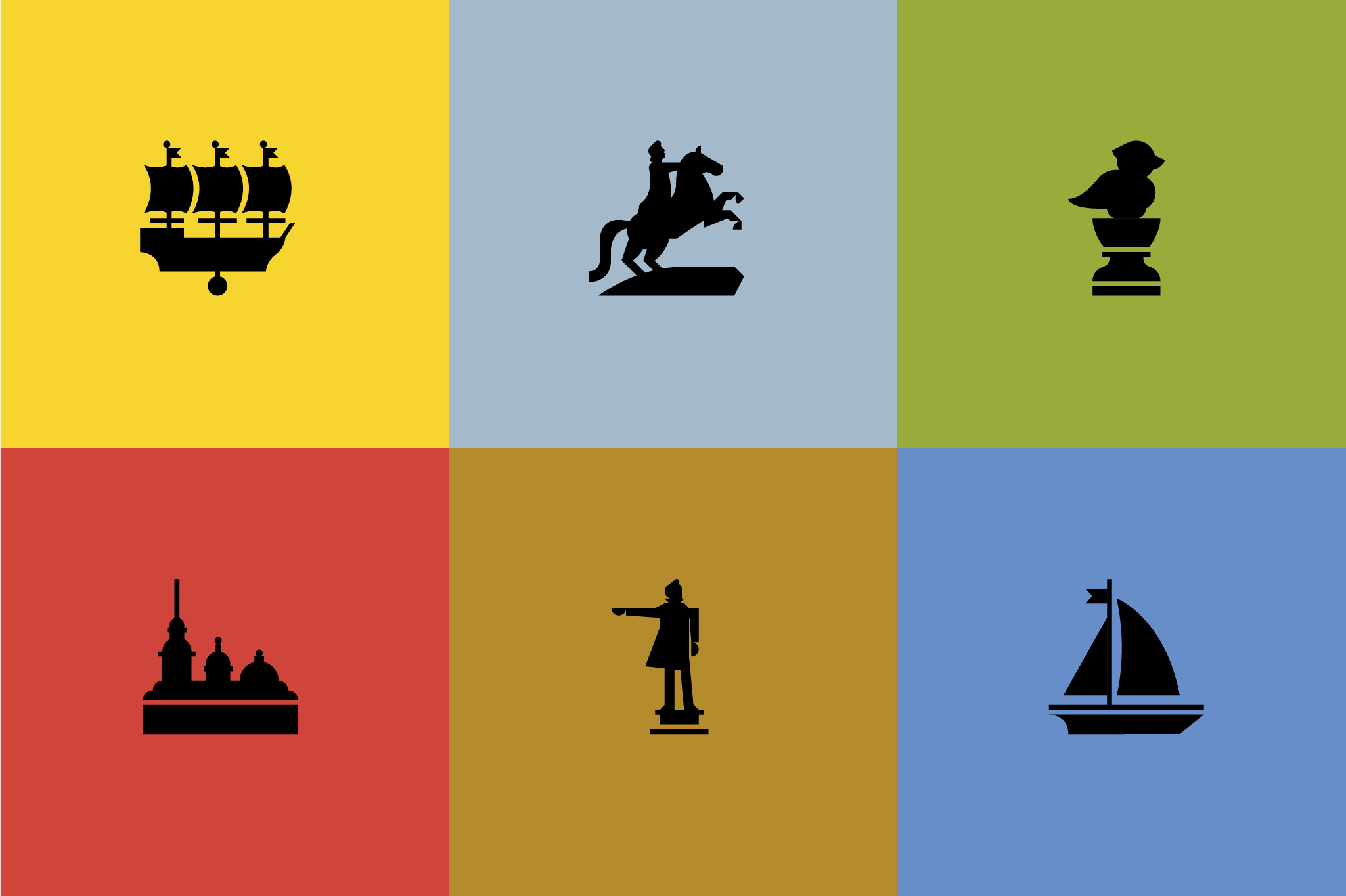
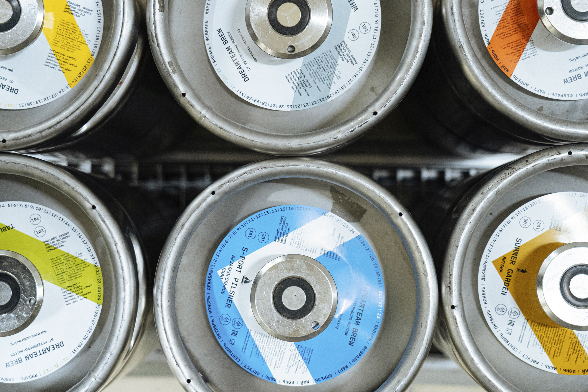
We took this as our starting point and refined these elements to create a more cohesive brand identity. Each beer has a specific colour and pictogram which represents a characteristic landmark in St. Petersburg, providing the inspiration for its name and recipe.
Then came one of the coolest challenges: to find a typeface with Cyrillic script that conveyed this cleaner urban/industrial feel we wanted for the brand. Given Dreamteam Brew’s deep roots in the port city of St. Petersburg, we went for a monospaced font which connects to the typography used on the containers being loaded at the port. This typeface is used across all branding elements, from the logotype and beer labels to more graphic applications like posters and social media.
Overall we wanted to achieve a cleaner look for the brand, and that’s also why we chose white as the background and a bolder ‘V’ shape. This makes the labels more distinctive and highlights the different categories, and will allow us to expand the brewery’s product range in the future, for example with the new alcohol-free range.