A brand identity for a specialty coffee project based in Gran Canaria, rooted in origin and traceability.
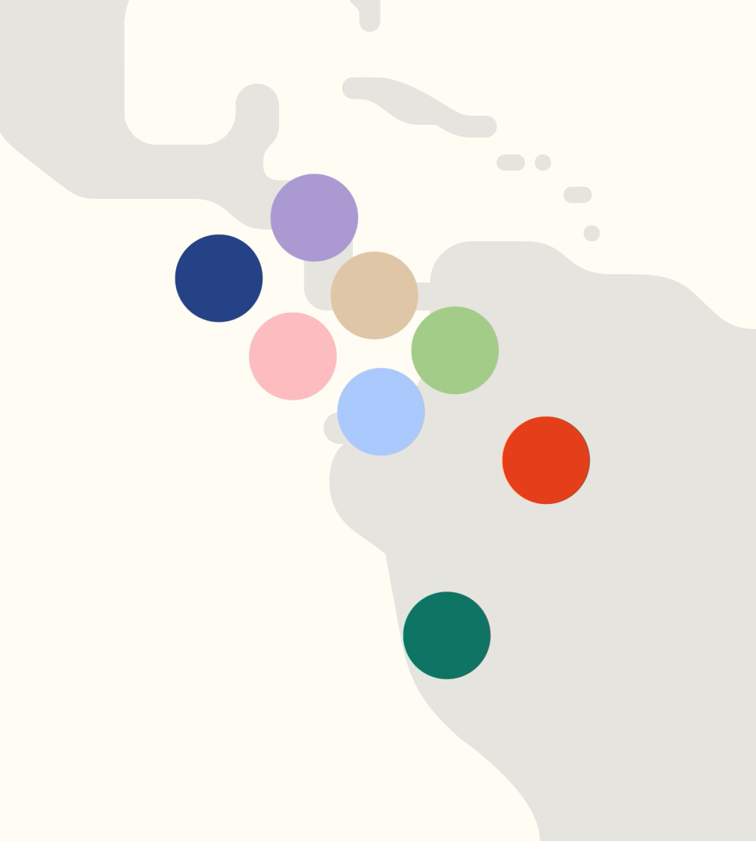
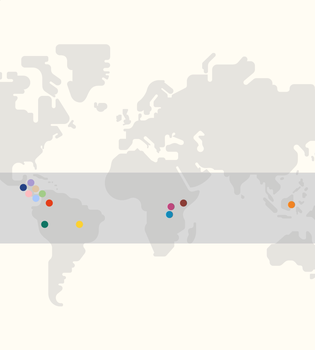
Cuptural is built around the idea of the coffee belt, the region around the equator where coffee grows under specific conditions of climate and altitude. This concept becomes the foundation of the identity, translating origin into a clear and structured visual system.
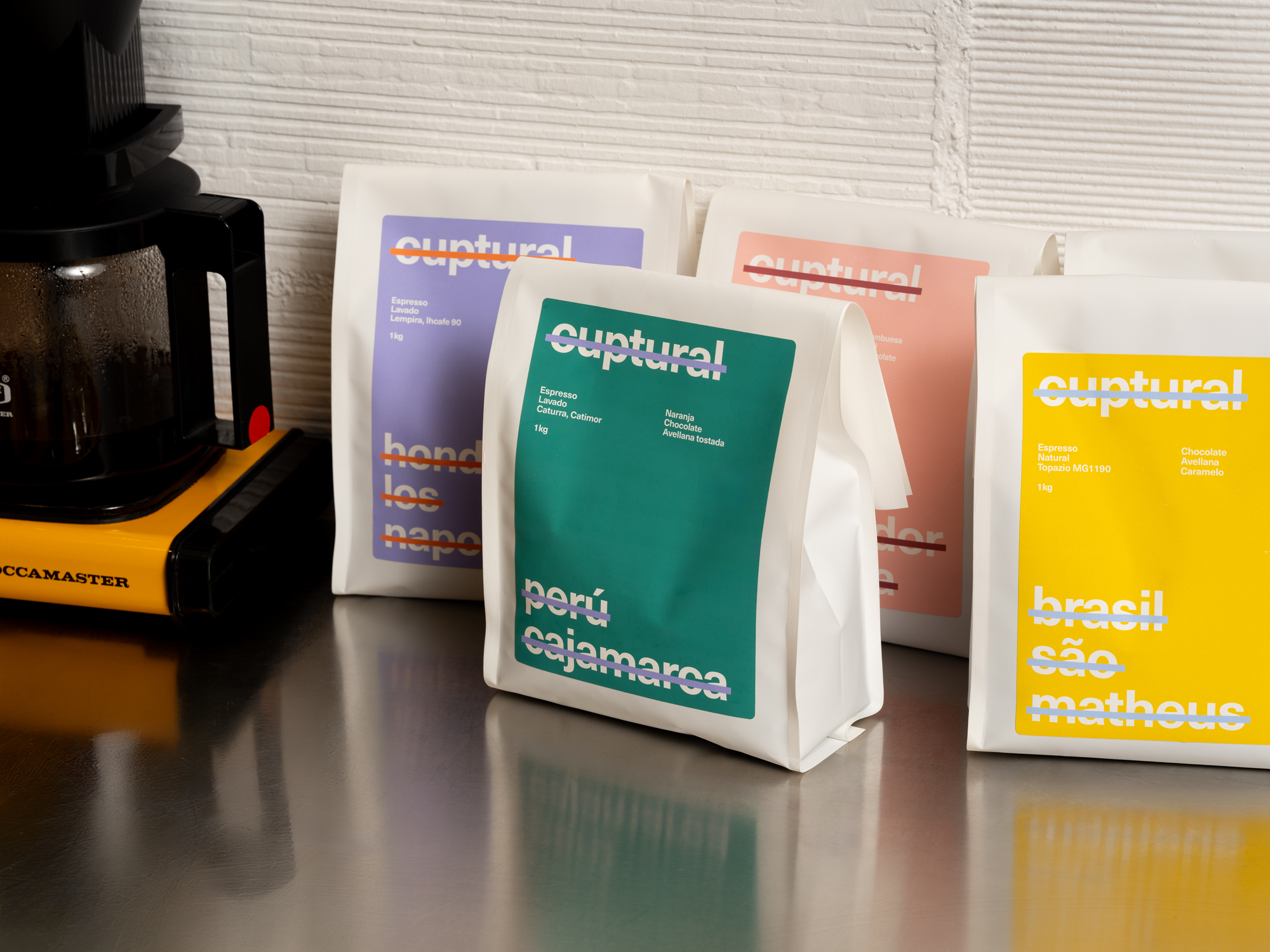
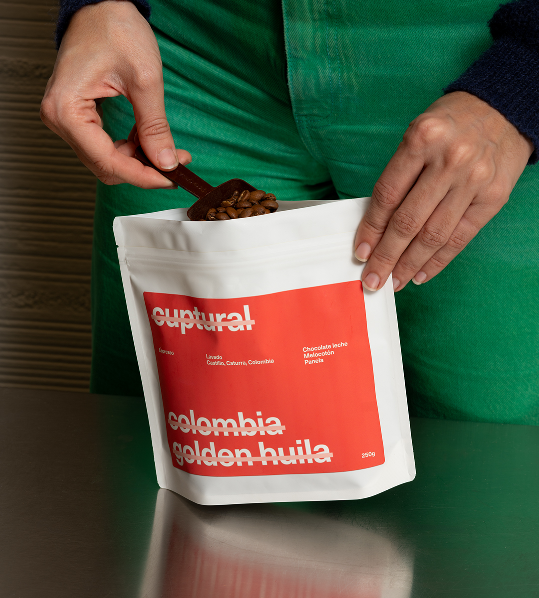
A simple graphic gesture, a horizontal strike, is used to organise information and highlight key elements across the brand. It moves through packaging, headlines and communication, creating a consistent and recognisable language.
Colour plays a key role in the system, with each tone representing a different country of origin. This allows every coffee to be quickly identified while expressing the diversity of territories, flavours and processes.
The system combines these colour codes with a straightforward typographic approach, prioritising clarity and consistency across all applications.
The identity focuses on clarity and structure, reinforcing Cuptural’s commitment to the product and its origin.