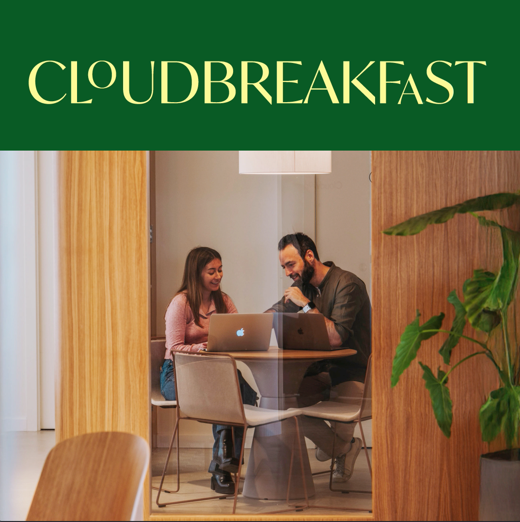
Redesigning Cloudworks as it grows into a more business-focused company
Originally conceived as a brand for a new generation of coworking spaces, Cloudworks has evolved into a more mature and business-oriented platform. The redesign responds to this shift, refining the identity to better align with its current positioning.
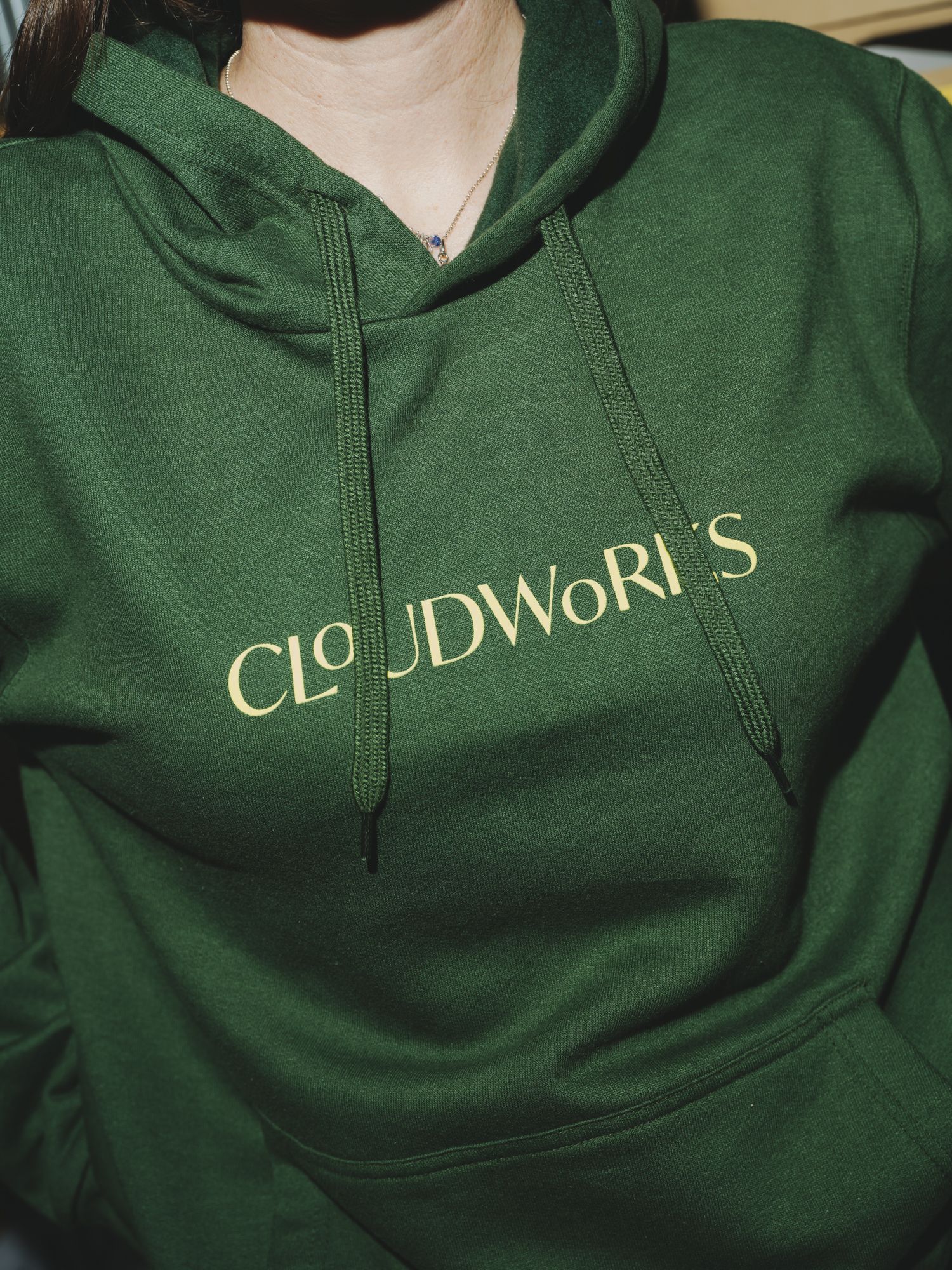
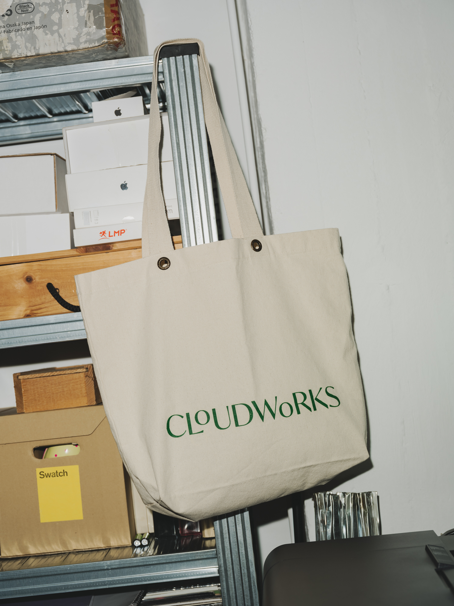
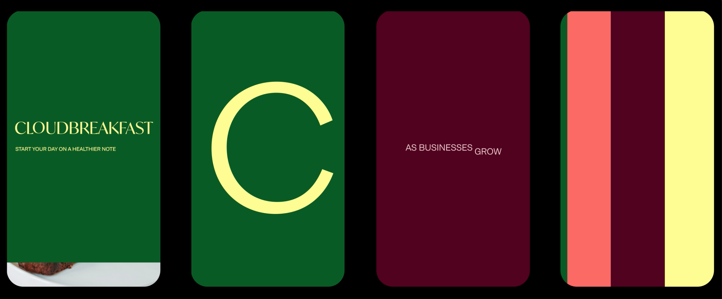
Rather than starting from scratch, the new system builds on the foundations we created years ago, enhancing and elevating them. The typography has been carefully customised to introduce a more confident and distinctive tone while maintaining continuity with the original brand.
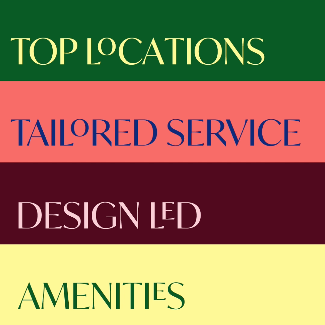
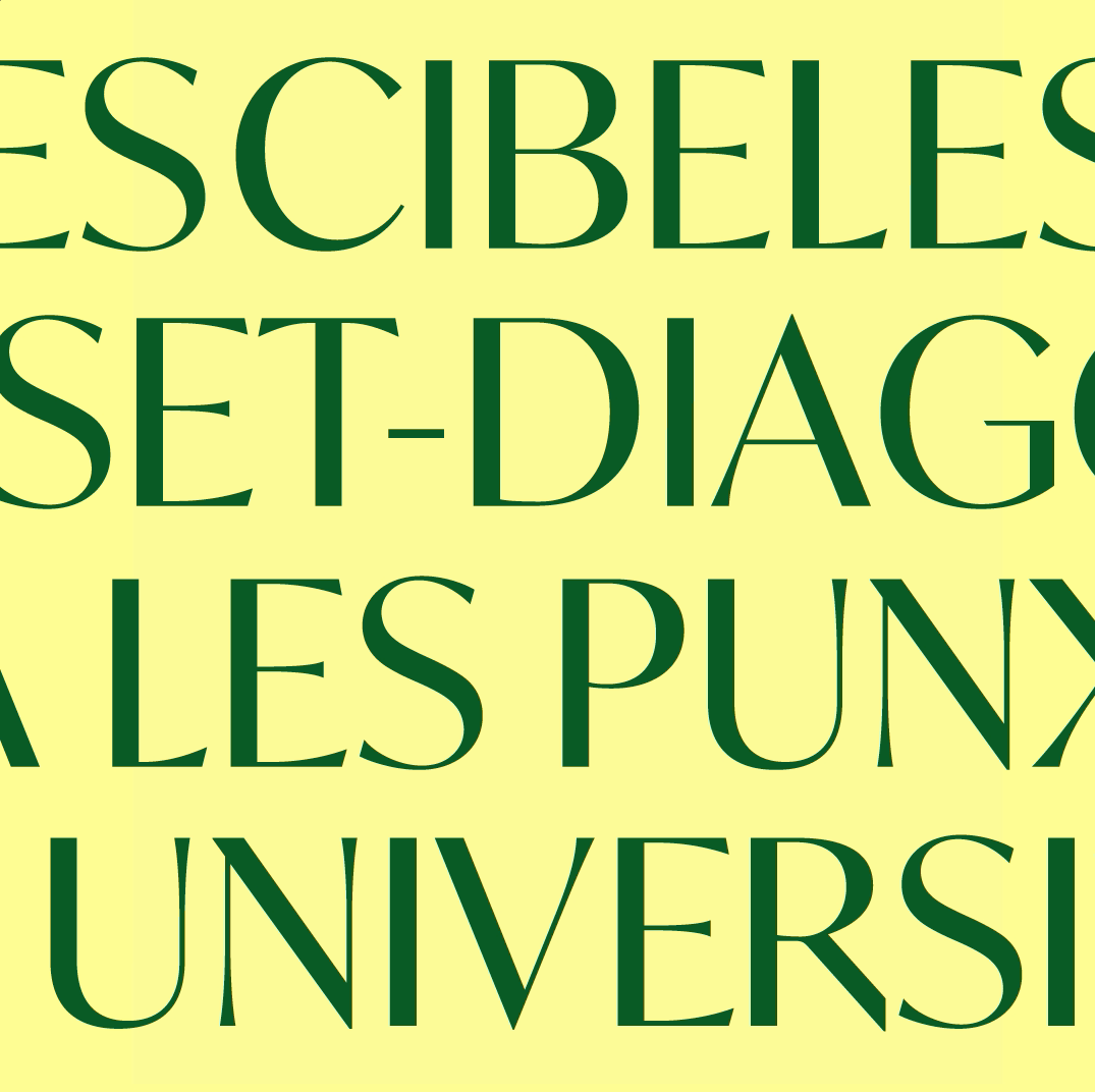
A key element of the original identity, the distinctive treatment of the “O” in the logo, becomes the starting point for a broader typographic system. This logic is extended across headlines and vocal elements, creating a cohesive and recognisable visual language that moves beyond the logo itself.
The updated colour palette and compositional approach add depth and flexibility, allowing the identity to operate across a wider range of contexts, from cultural initiatives to a more corporate environment.
The result is a more defined and scalable identity, one that reflects Cloudworks today while staying connected to its origins.