A graphic identity of flexibility, synergy, and genuine connection
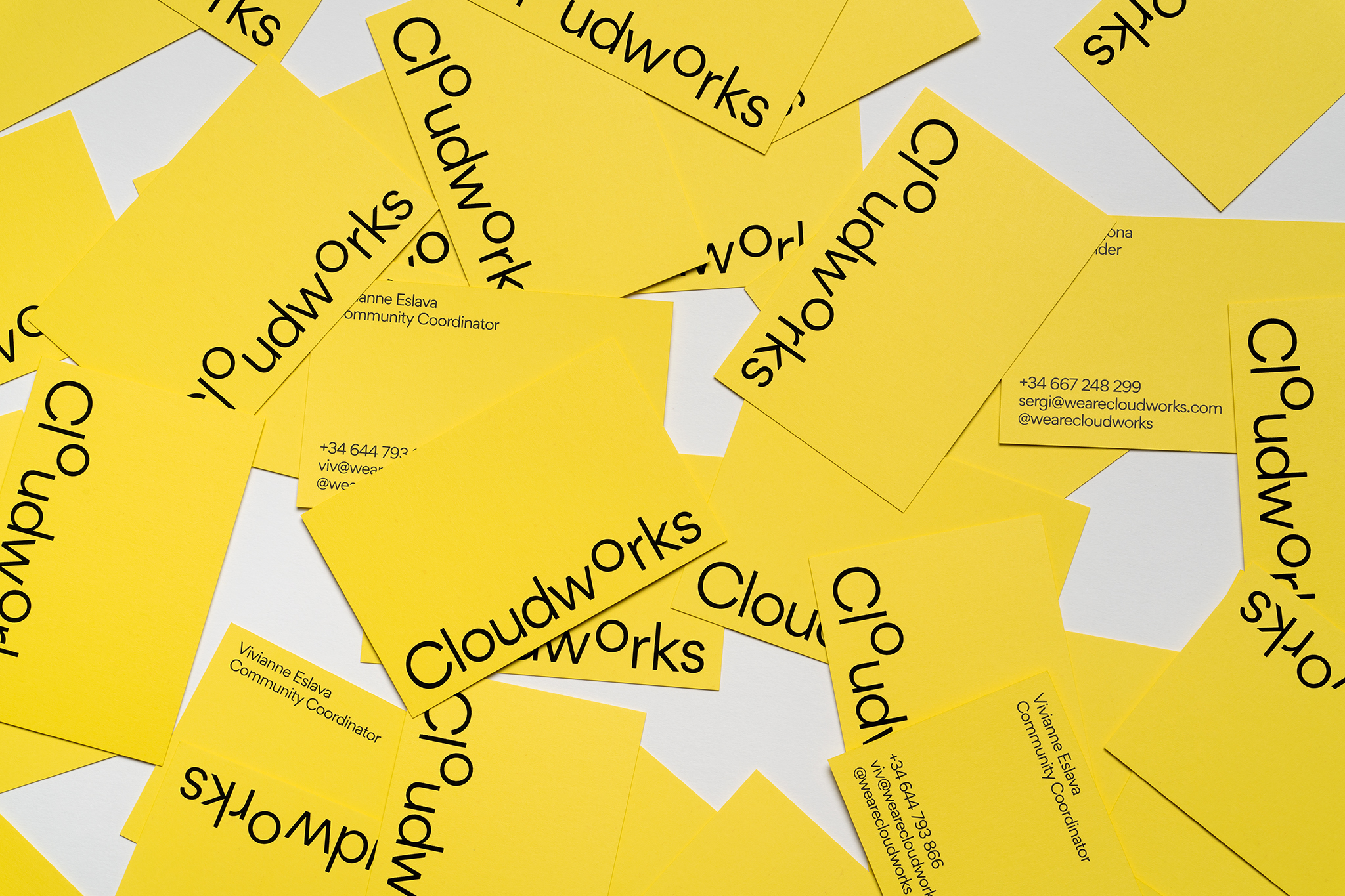
The name Cloudworks makes us think of work on the cloud and superior projects. The cloud in our logo expresses an attitude. It refers to quality, to a distinctive status that’s not exclusive but rather special and unique.
Cloudworks makes us think of space – because clouds are found at great heights, looking out over distant vistas – and also of work, that of the brand but also that of its clients, accomplished professionals in a range of sectors. A young and entrepreneurial professional community in which people work, get to know each other and exchange ideas.
There’s a great deal of movement and connections are formed. These are the elements that the Cloudworks logo seeks to distil in graphic form. In the logo, Cloudworks is written as one word, highlighting the idea of unity and group work.
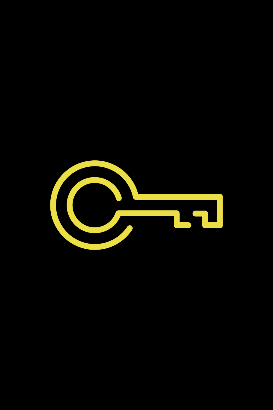
The ‘o’ plays a special role as the most balanced and perfect character. The ‘o’ is a closed circle, representing unity and synergy. We have positioned the ‘o’ above the other letters as if it were a cloud, emphasising the importance of community and giving the logo additional dynamism.
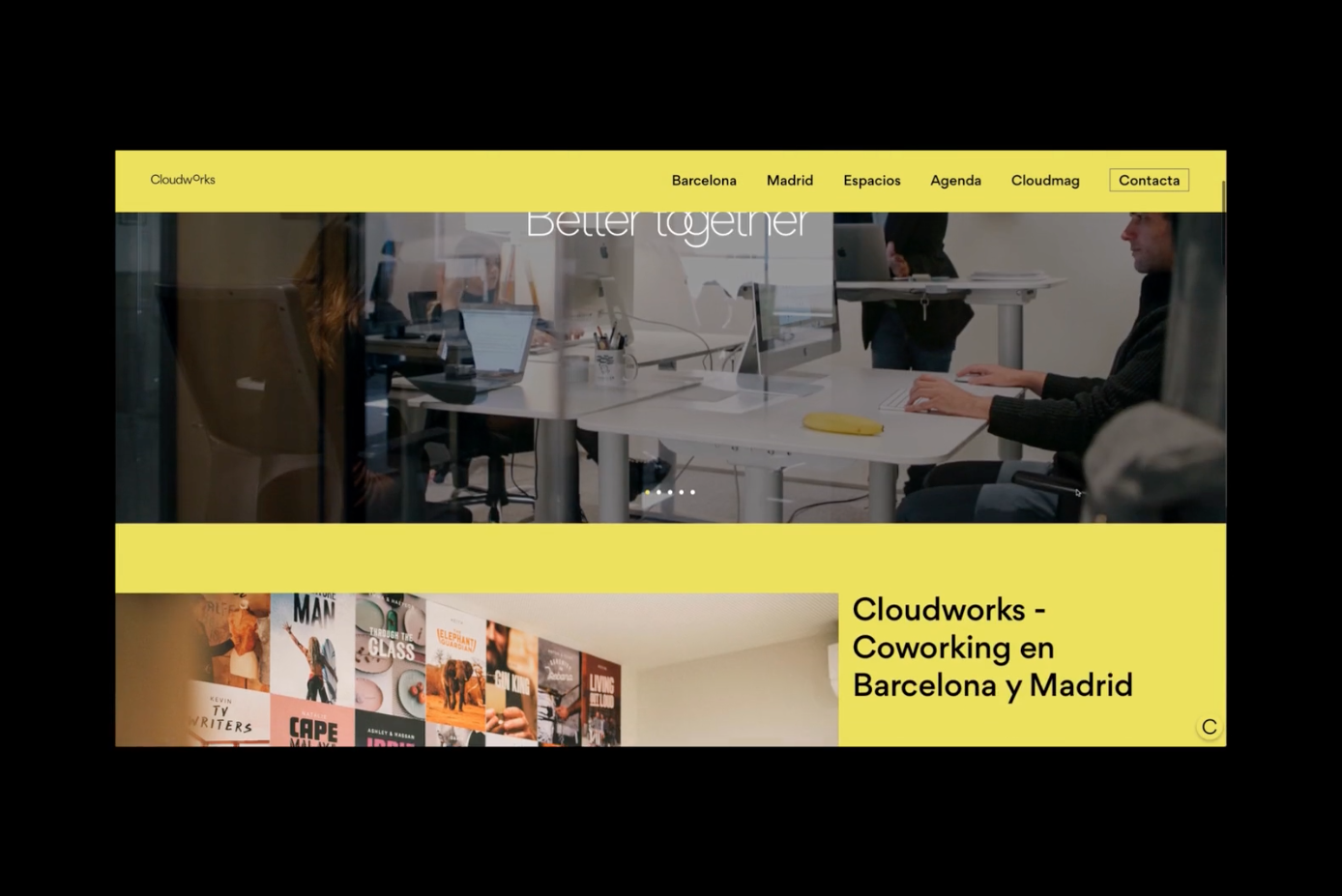
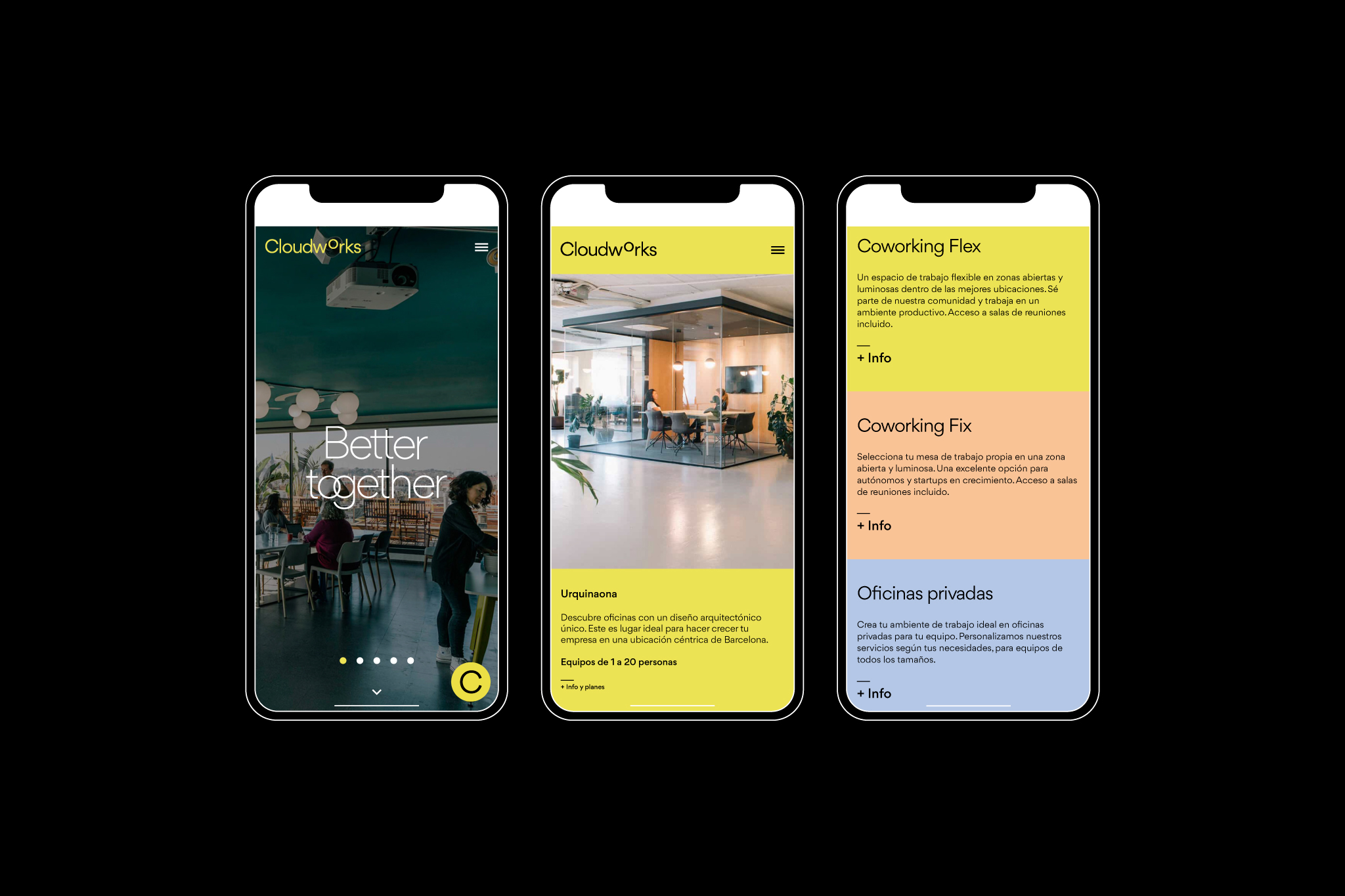
An identity that’s flexible, changeable, adaptable and in movement. While remaining apart from typical design trends in this sector to generate a more genuine language.