ESPN
Captivating body lettering
Client
ESPN
Services
Lettering evolution: strong strokes and geometric Energy for ESPN
We have created two typographies for the American sports publication ESPN.
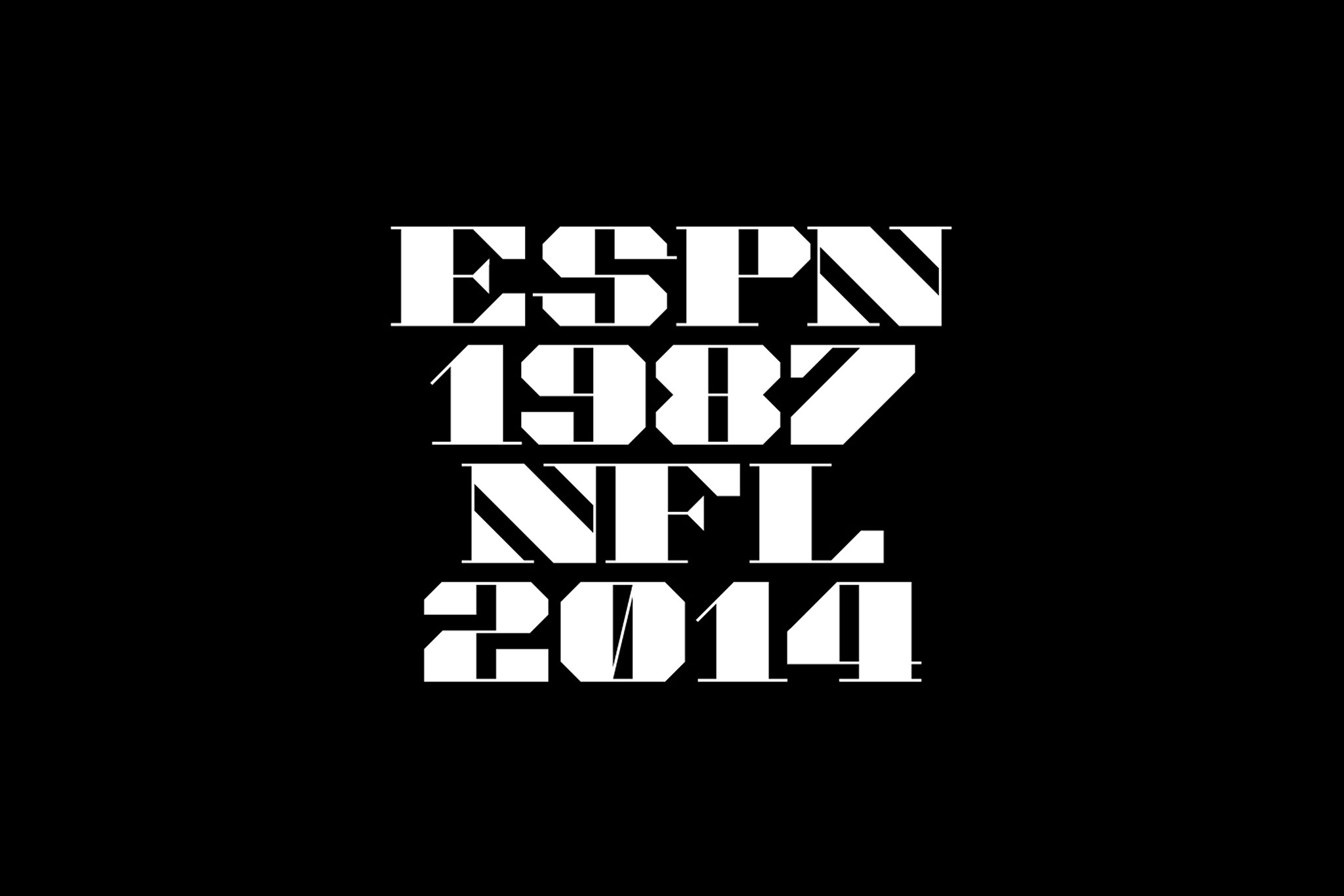
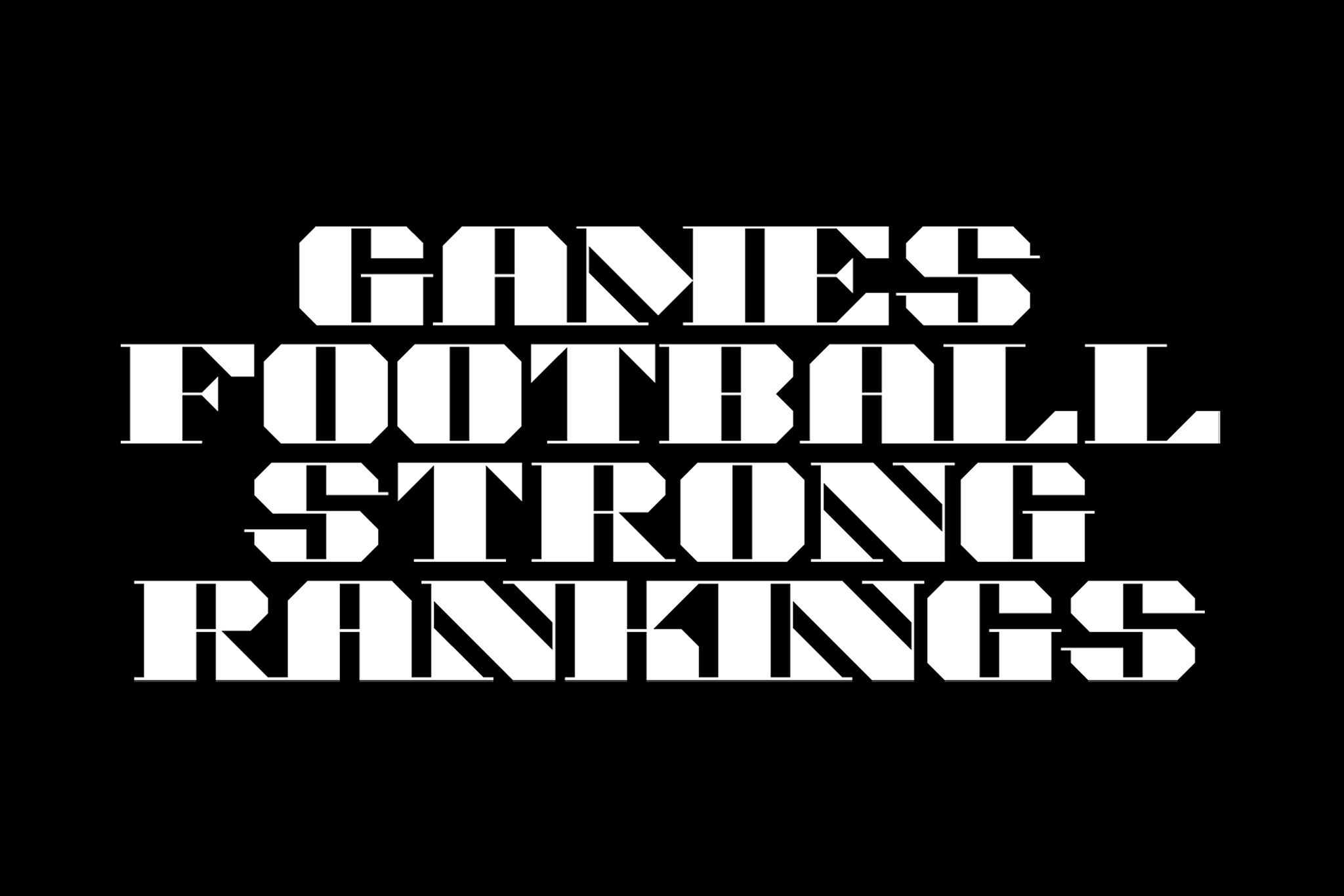
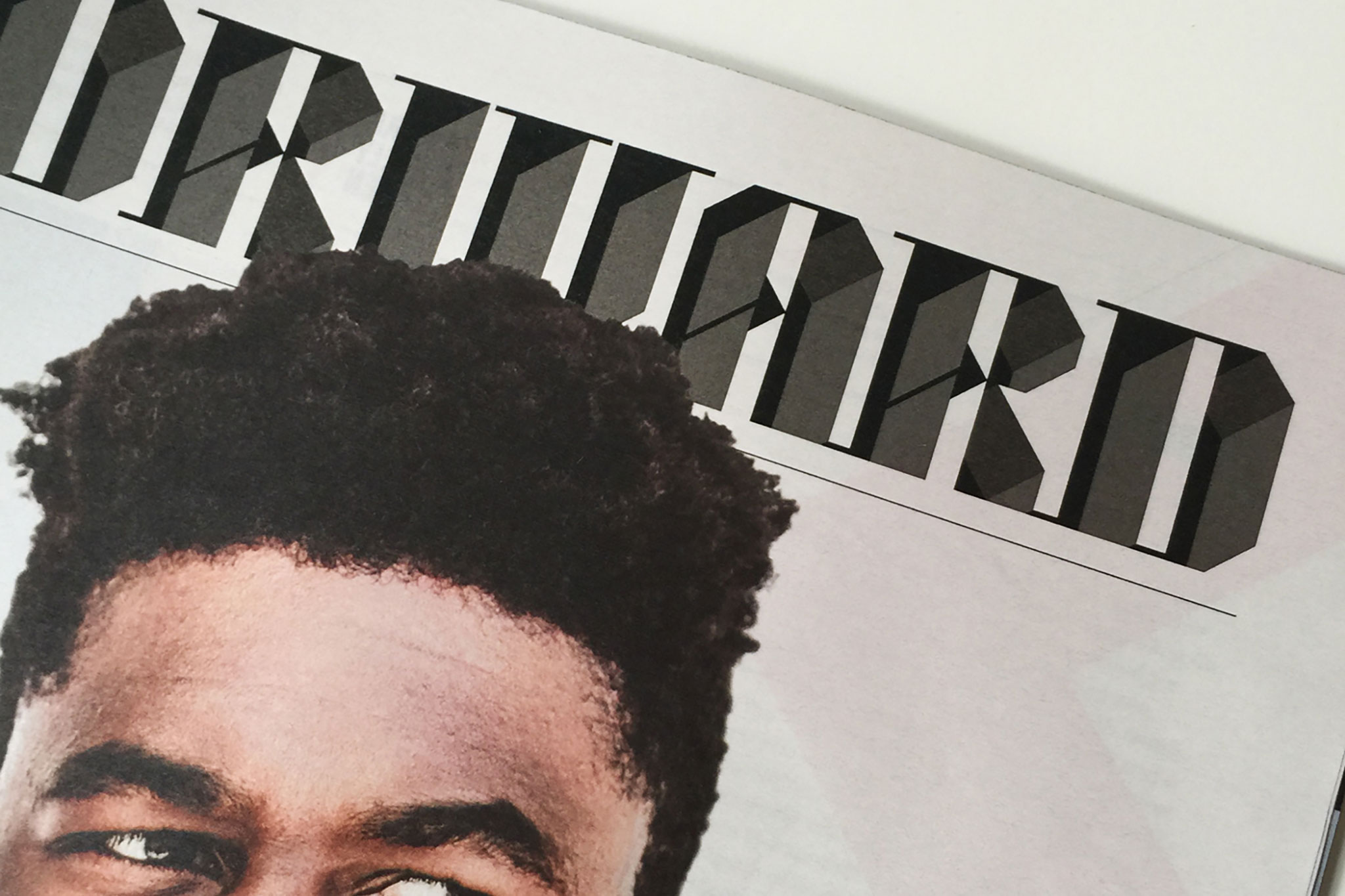
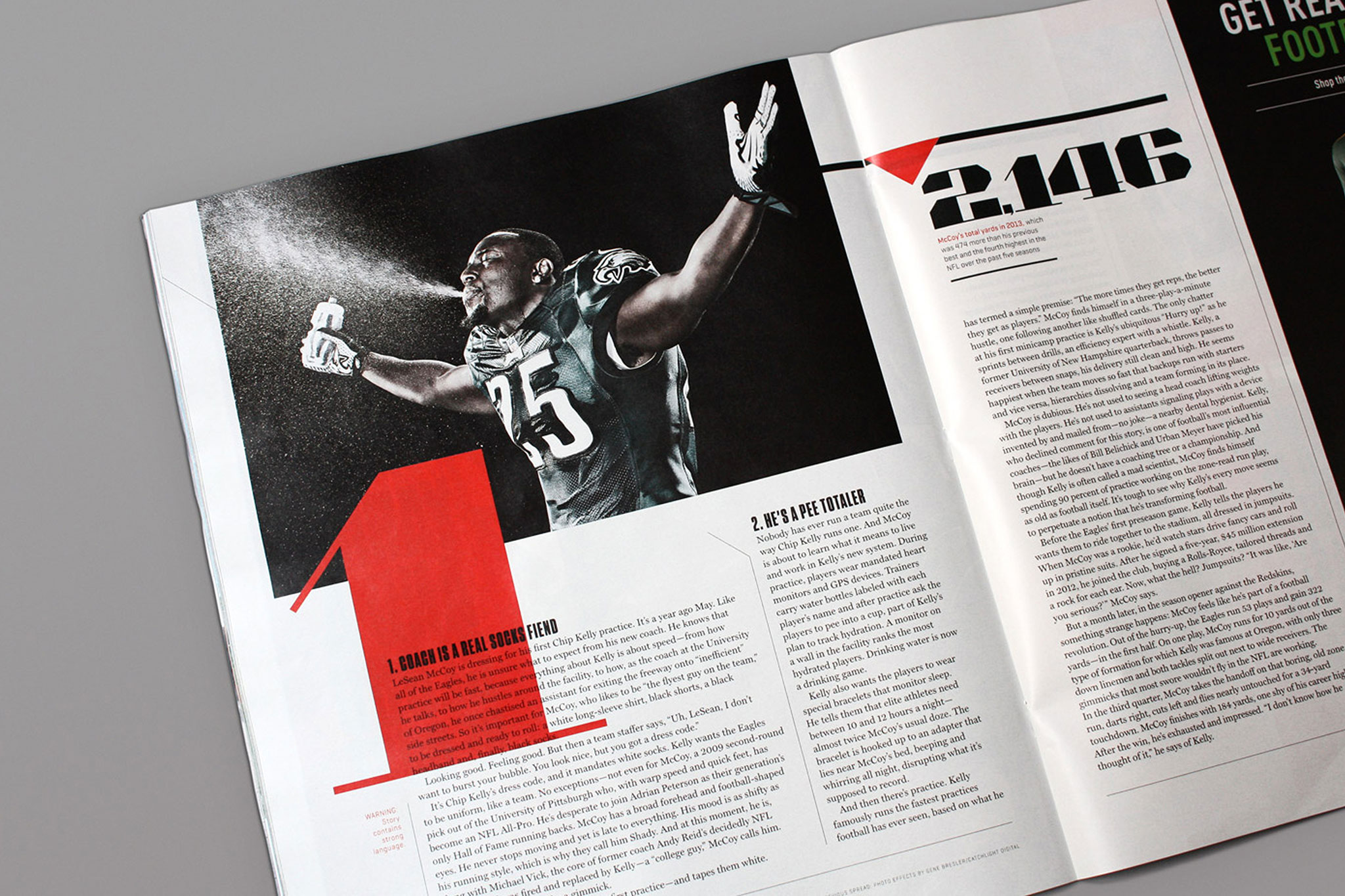
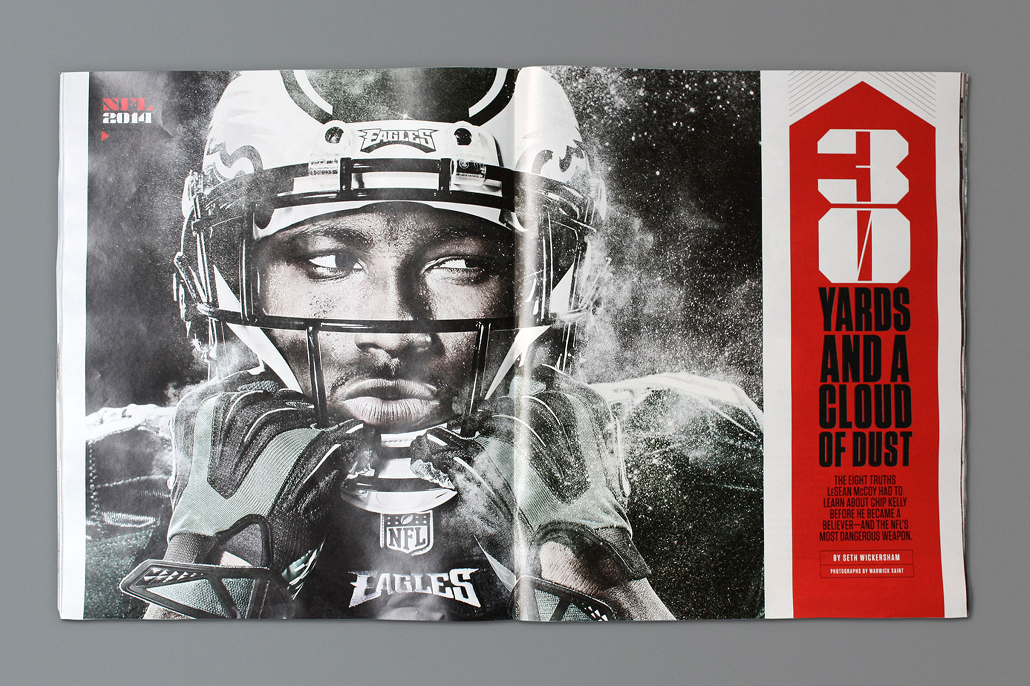
In 2014 we created a display typeface for a NFL special issue. We designed a strong and masculine graphics with letters that contrast highly in their strokes. All characters combine a very fine serif with a cut across the hard corners. The uppercase and numerical typeface appear all over the magazine alongside powerful images.
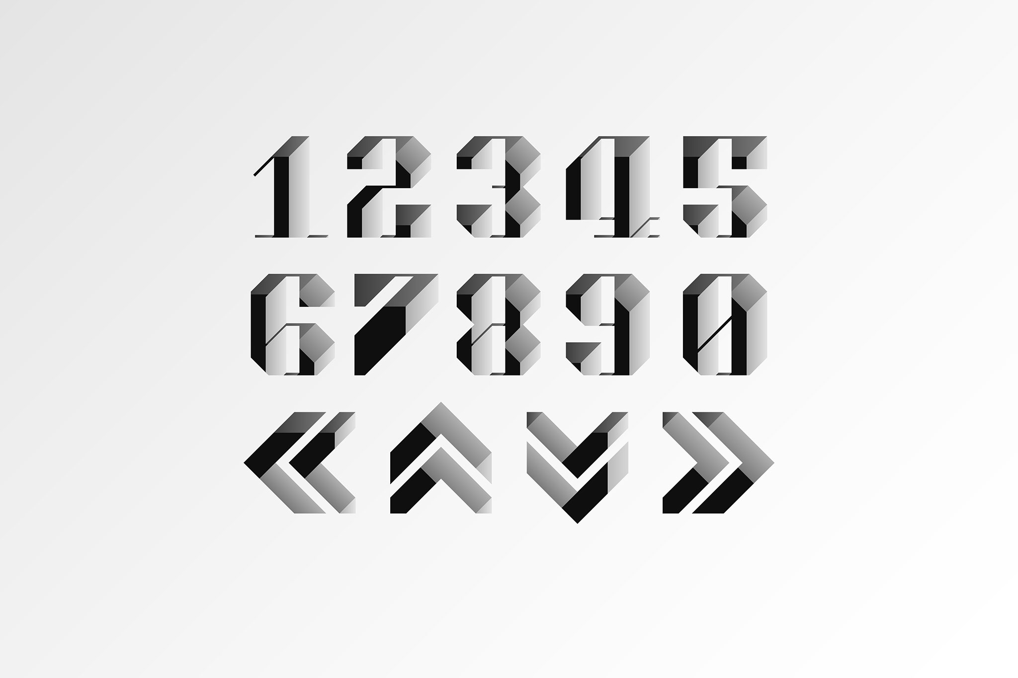
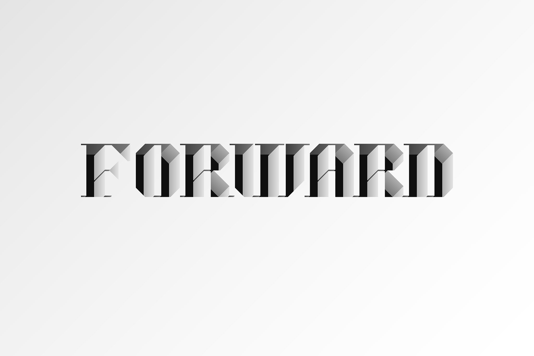
In 2015 the magazine was looking for a lettering with volume to lead into their section, Forward, where in-depth articles are published. The solution was to design display letters cut geometrically and in bas-relief to represent the energetic nature of sports people.
Client
ESPN
Services