Elevating architecture: SNA Architects’ dynamic branding and website redefine spatial design
Sophie Nguyen Architects is a London based practice that specialises in architectural design, renovation and build completion. Their built projects include residential work as well as studies with Arup Consulting Engineers. Their philosophy is that spaces are beautiful, spacious and noble, no matter how small or complex they are.
The company was looking for a visual rebranding and website design to show their portfolio and services. The brand objective was to express a vibrant and dynamic studio and to attract new work of high design quality by expressing their values of simplicity, creativity, thoroughness and reliability.
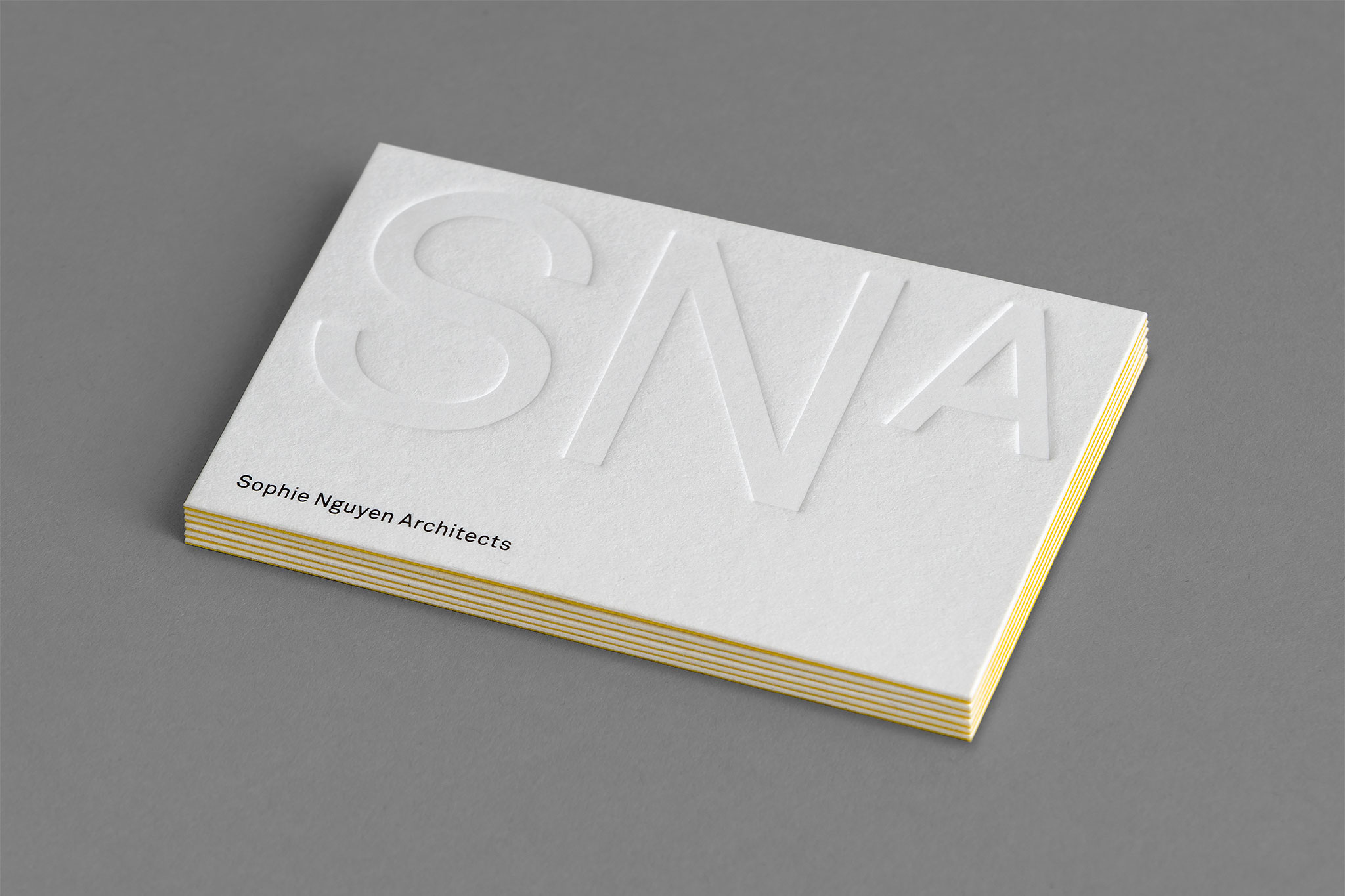
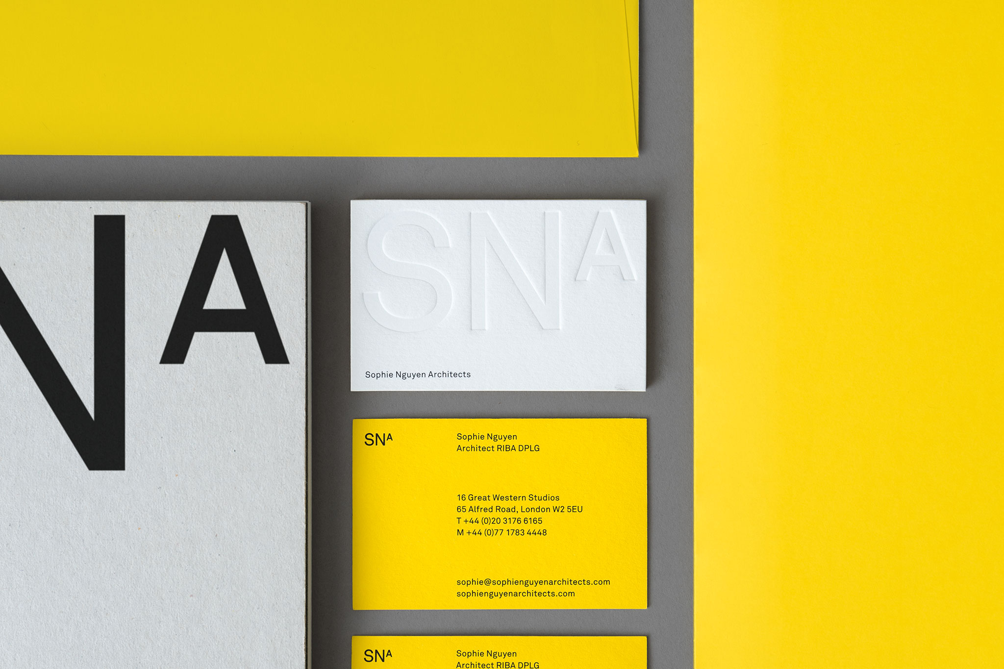
Our solution came from a wordmark that uses the initials of the studio name and bright color palette. The square meter reference emphasizes one of the most important ways the studio works. SNA have a profound understanding of space; they believe it is a precious commodity and they always set out to make spaces that reflect and enhance the way people want to live and, that are also a pleasure to spend time in.
Bold letters structured in a rectangle that brings to mind the idea of square meters and more subtly suggests the periodic table.
In the periodic table ‘Sn’ is the symbol for tin and one of metal’s properties is its conductibility due to its freely moving electrons. SNA uses the flow or the movement created between living spaces to give their projects a special character. It was important to show movement and dynamism in their new identity.
The brand colours, yellow and white, represent natural light which plays an important role in SNA projects. Big windows and clear glass let the natural light pour into spaces.