A colourful take on wine
The visual identity for the Vila Viniteca Wine Tasting Championship is built around a simple idea: wine is never just one thing.
Rather than reducing it to the familiar choice of red or white, the concept celebrates wine as a world of nuance, layers and shared experiences. Every bottle carries different aromas, memories and emotions, making every tasting unique.
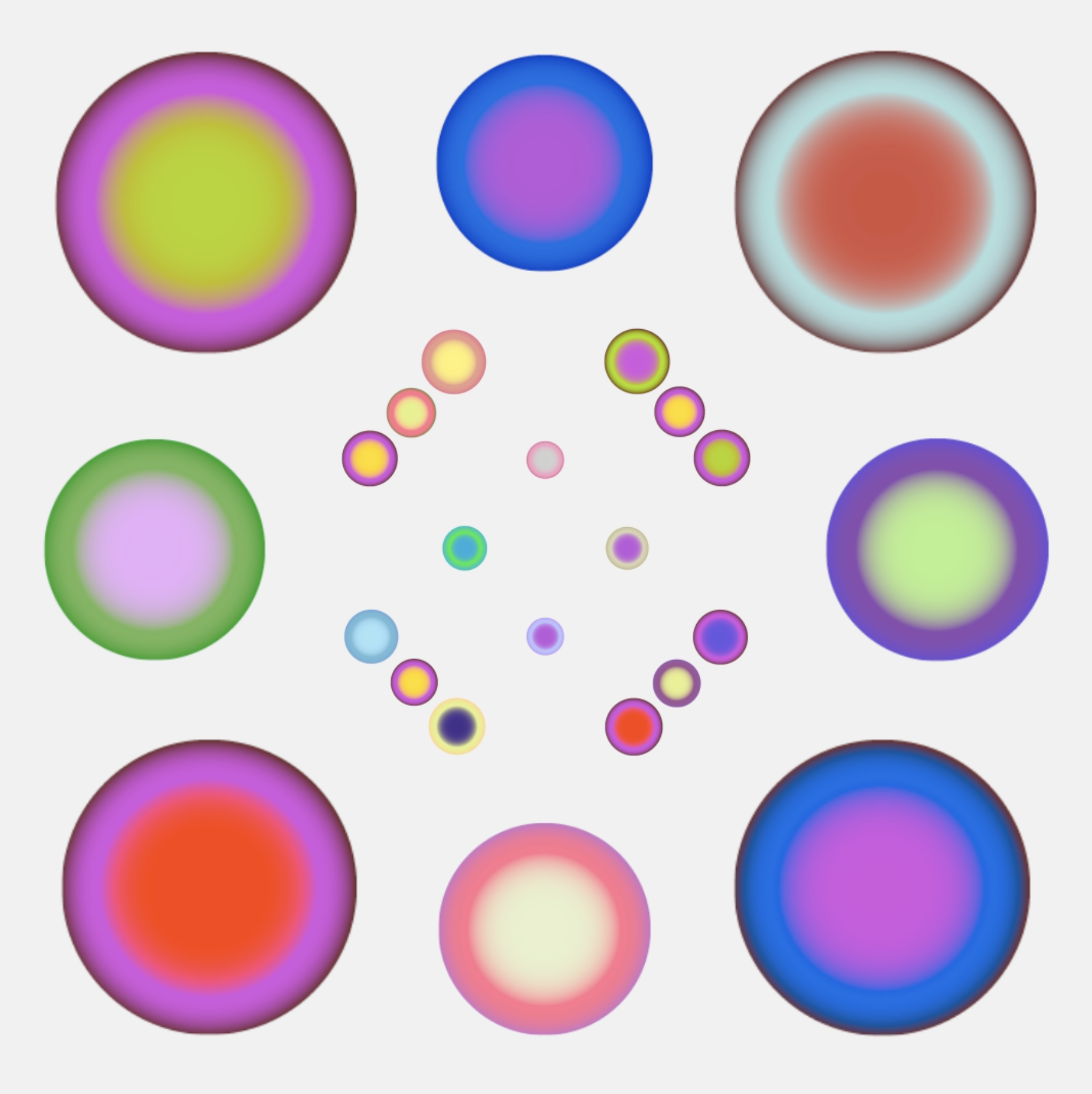
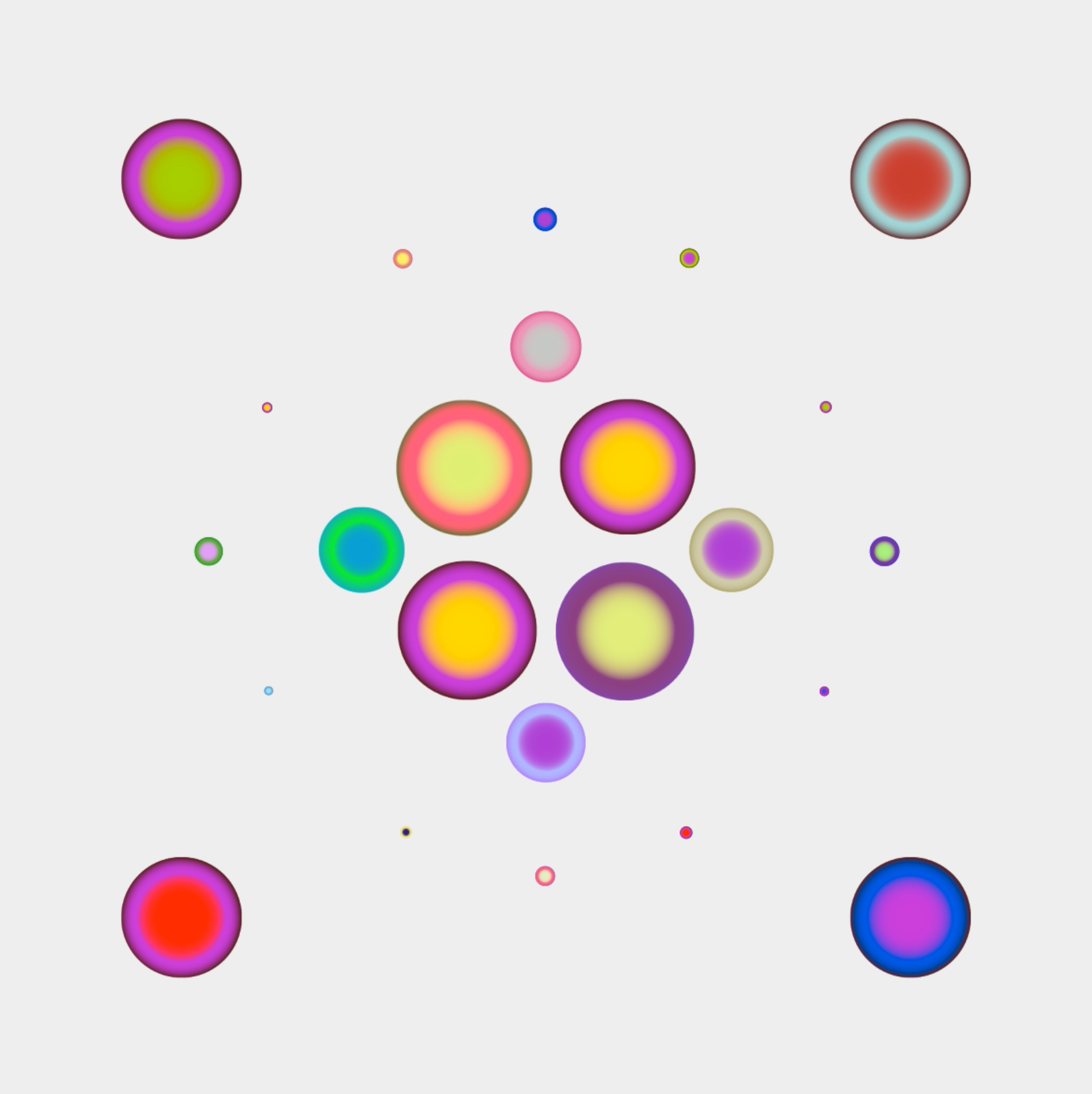
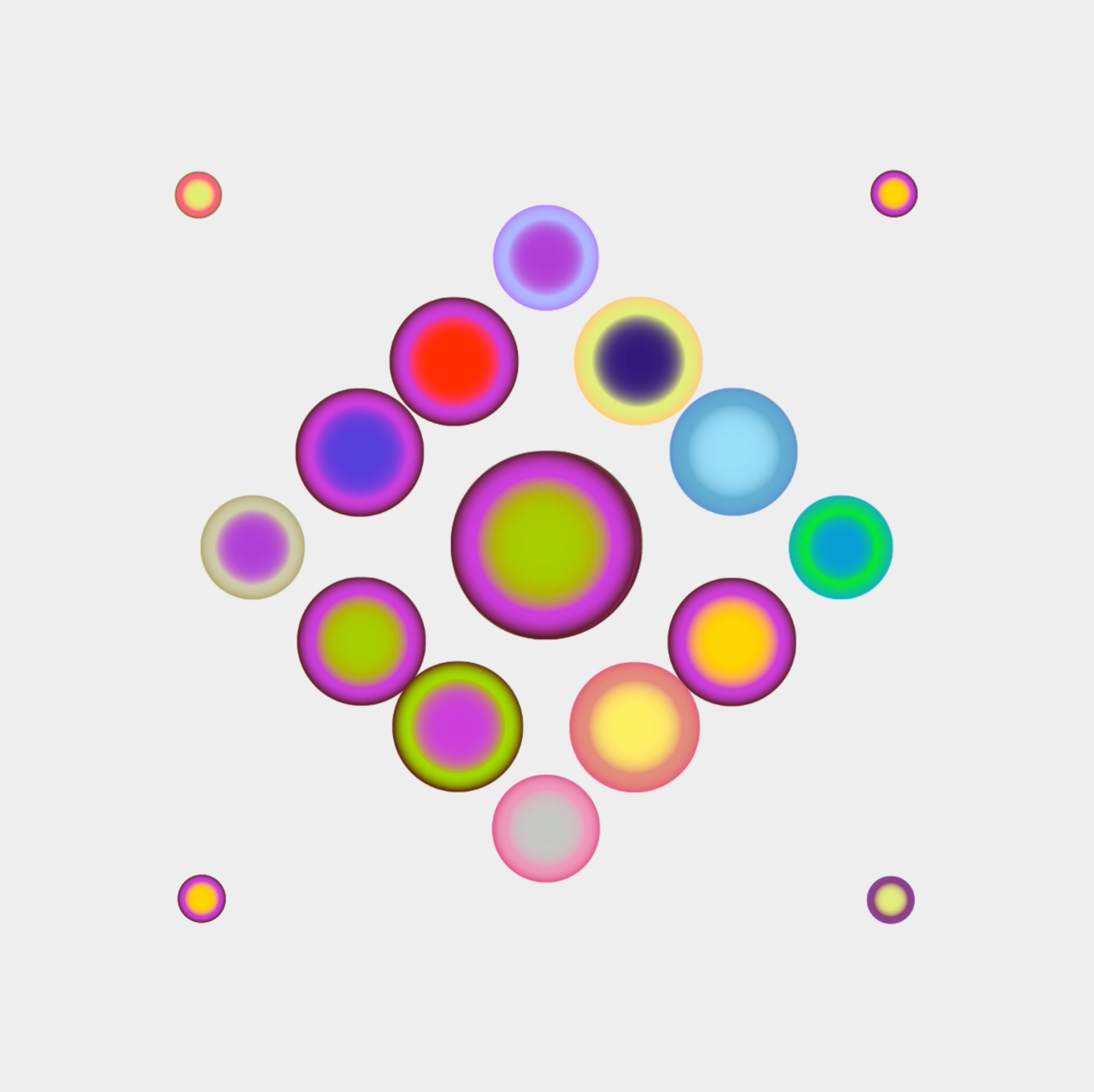
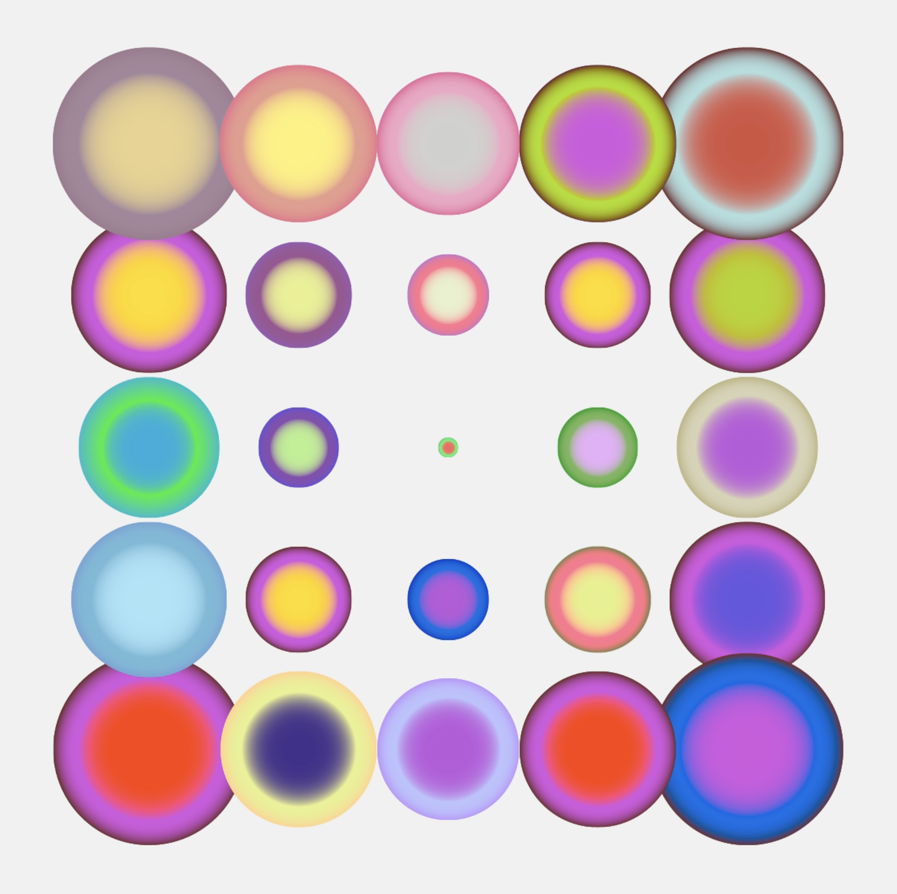
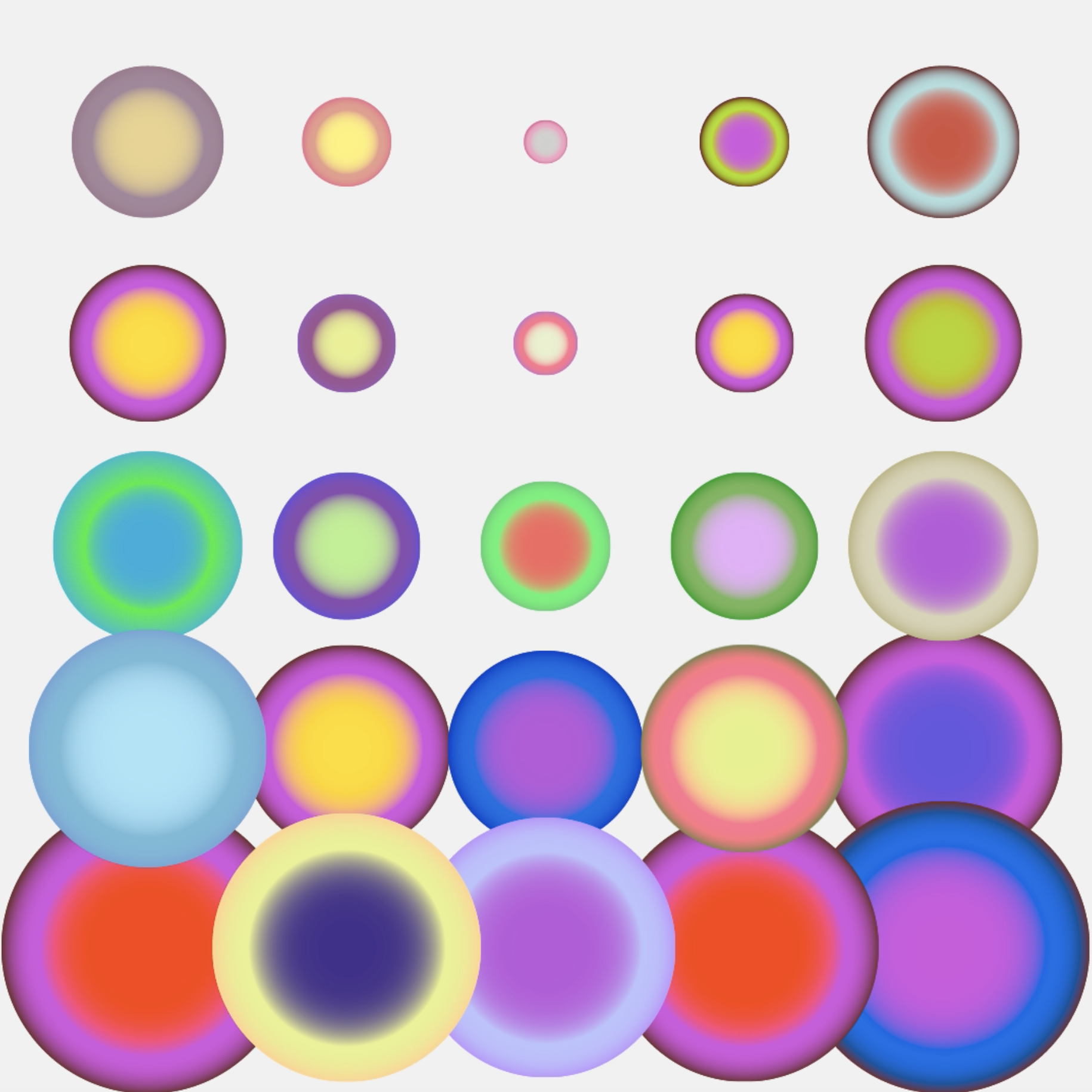
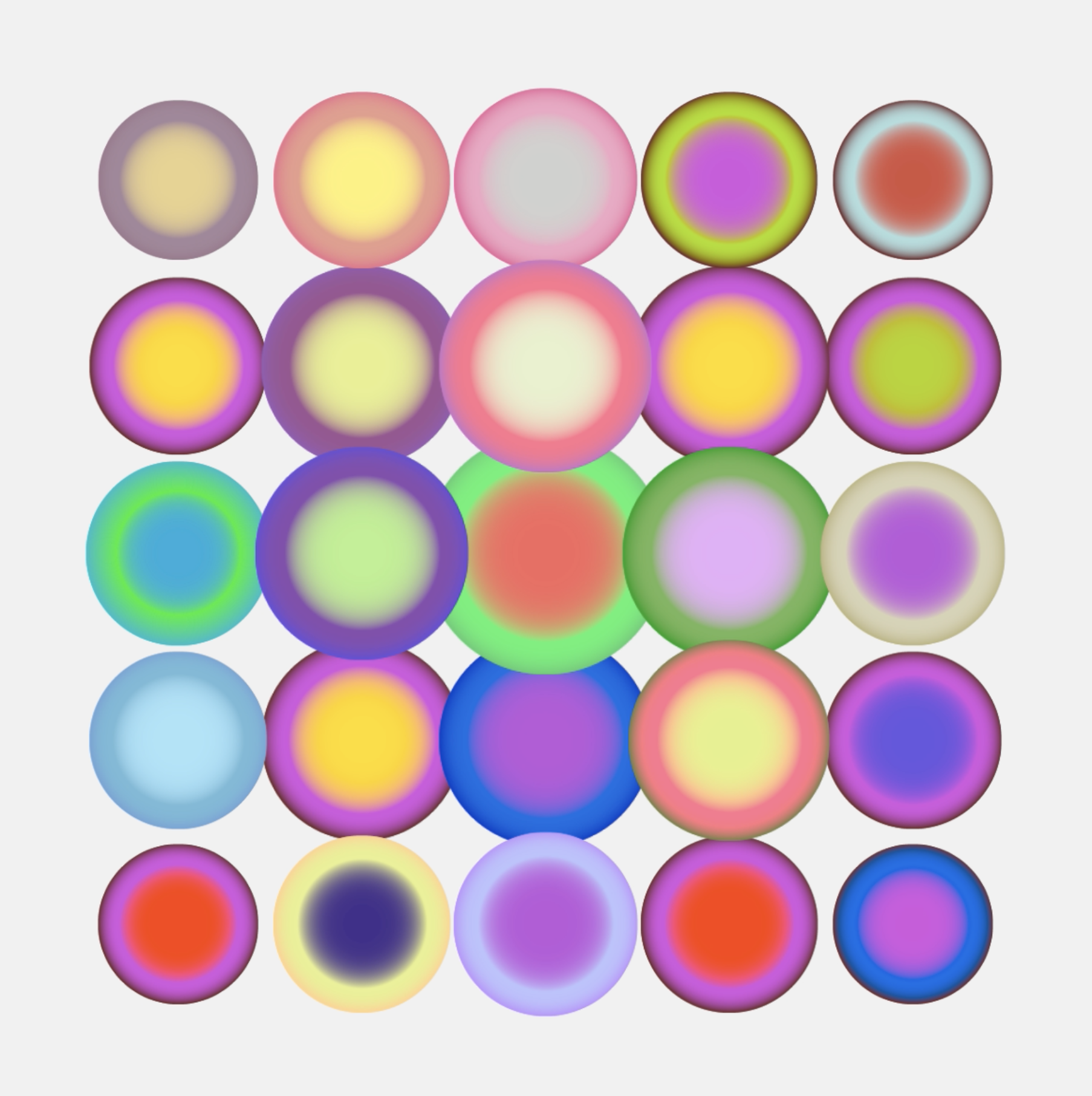
The visual system translates this idea through vibrant overlapping colours that blend, interact and create new relationships. They are not intended to represent wine literally, but to evoke its richness, diversity and complexity.
At the same time, the identity reflects the essence of the competition itself: blind tasting in pairs. Shapes intersect, overlap and support one another, expressing collaboration, trust and shared decision-making. Together, they gradually reveal the silhouette of a grape cluster—a symbol made from many individual parts that only becomes complete when they come together.The result is a visual language that captures both the culture of wine and the spirit of the championship: curiosity, dialogue, teamwork and discovery.